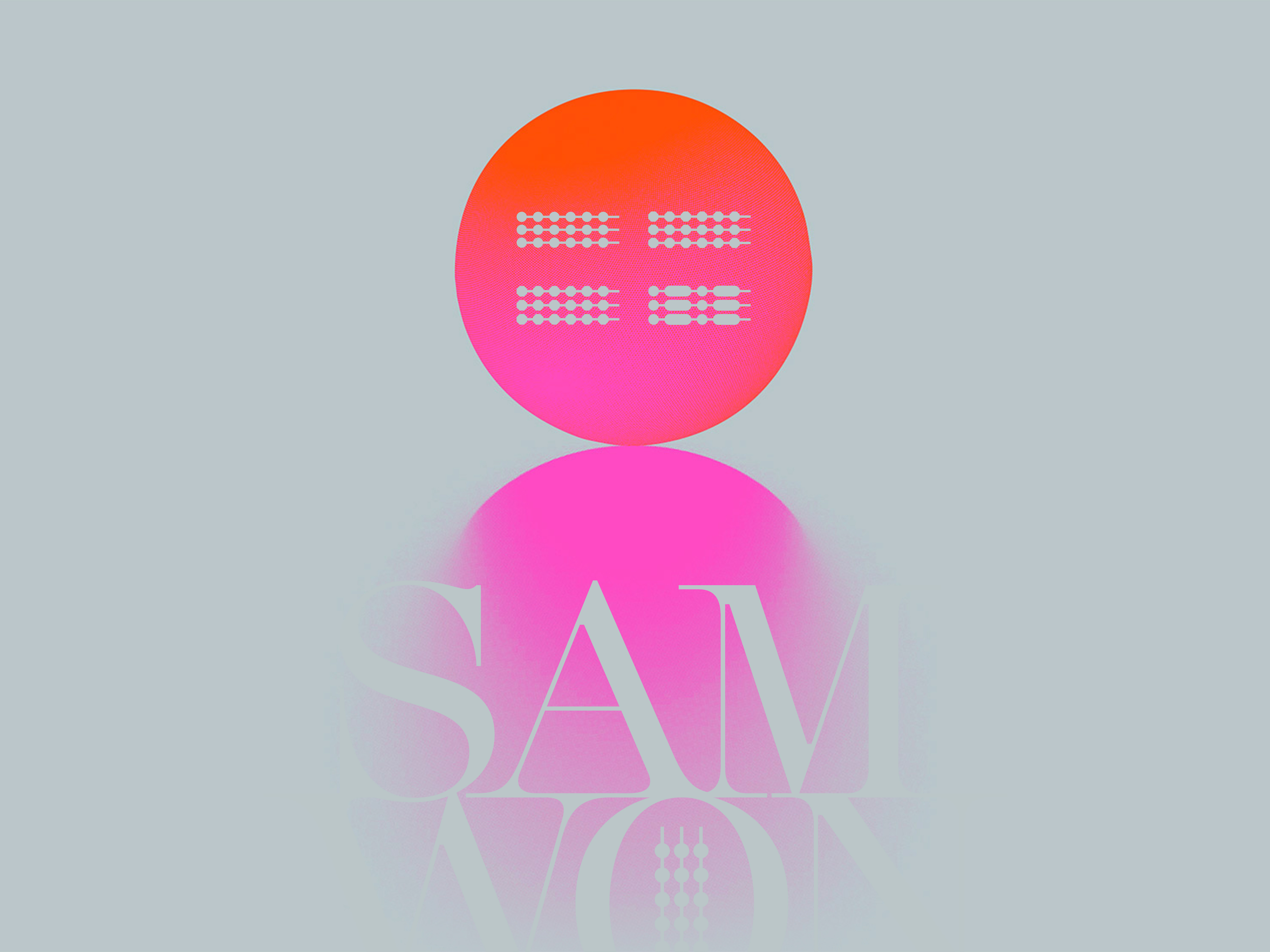
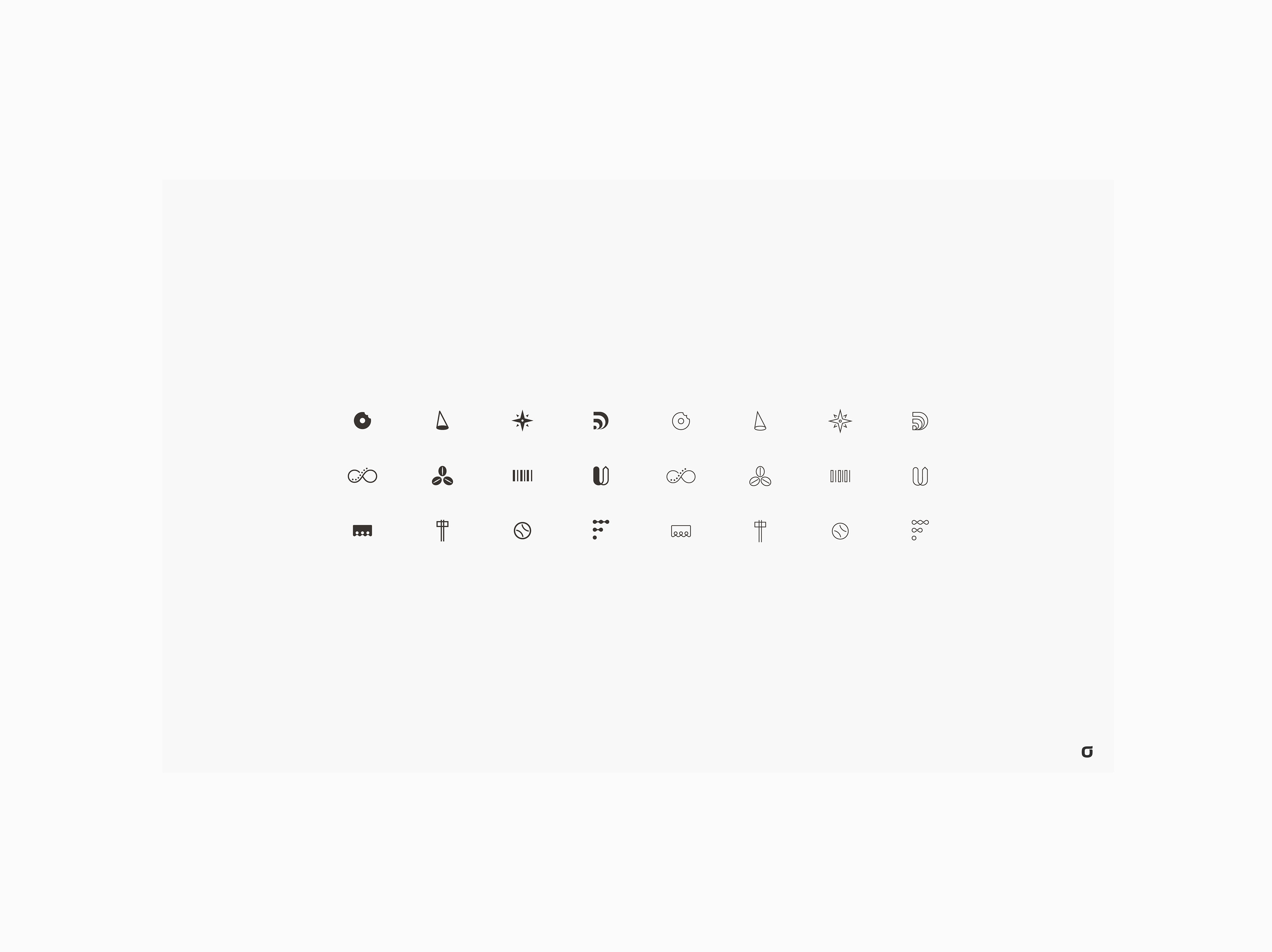
KT Olleh Membership - New icons (Karim Rashid style) for the Olleh membership card - The idea was to play the icons like only the insiders who own the Olleh membership can understand the code and the meaning of the icons
CHALLENGE: KT Corporation (Korea Telecom) desired a unique set of icons for their Olleh Membership premium card and corresponding marketing materials.
These icons needed to reflect the prestige of the Olleh brand while maintaining a similar visual style to the previously designed Samsung membership premium card icons by Karim Rashid, a world-renowned designer.
CONCEPT: inspired by the idea of exclusivity, I developed a concept centered around a coded language. The resulting icons are intentionally abstract, resembling a secret code that only Olleh members can decipher. This approach fosters a sense of community and belonging among members, as they hold the key to understanding the icons' true meaning.
THIS REDESIGN COMES WITH SEVERAL BENEFITS:
- The uniqueness of the abstract, code-based design sets the Olleh membership program apart from competitors, creating a visually distinct and memorable brand identity.
- Exclusivity by understanding the icons' meaning, members feel like part of an exclusive club, fostering brand loyalty and satisfaction.
- Intrigue, the coded nature of the icons sparks curiosity and encourages members to engage with the brand on a deeper level.
Overall, this graphic design solution effectively balances the need for brand recognition with a touch of exclusivity, creating a premium membership experience for Olleh members.
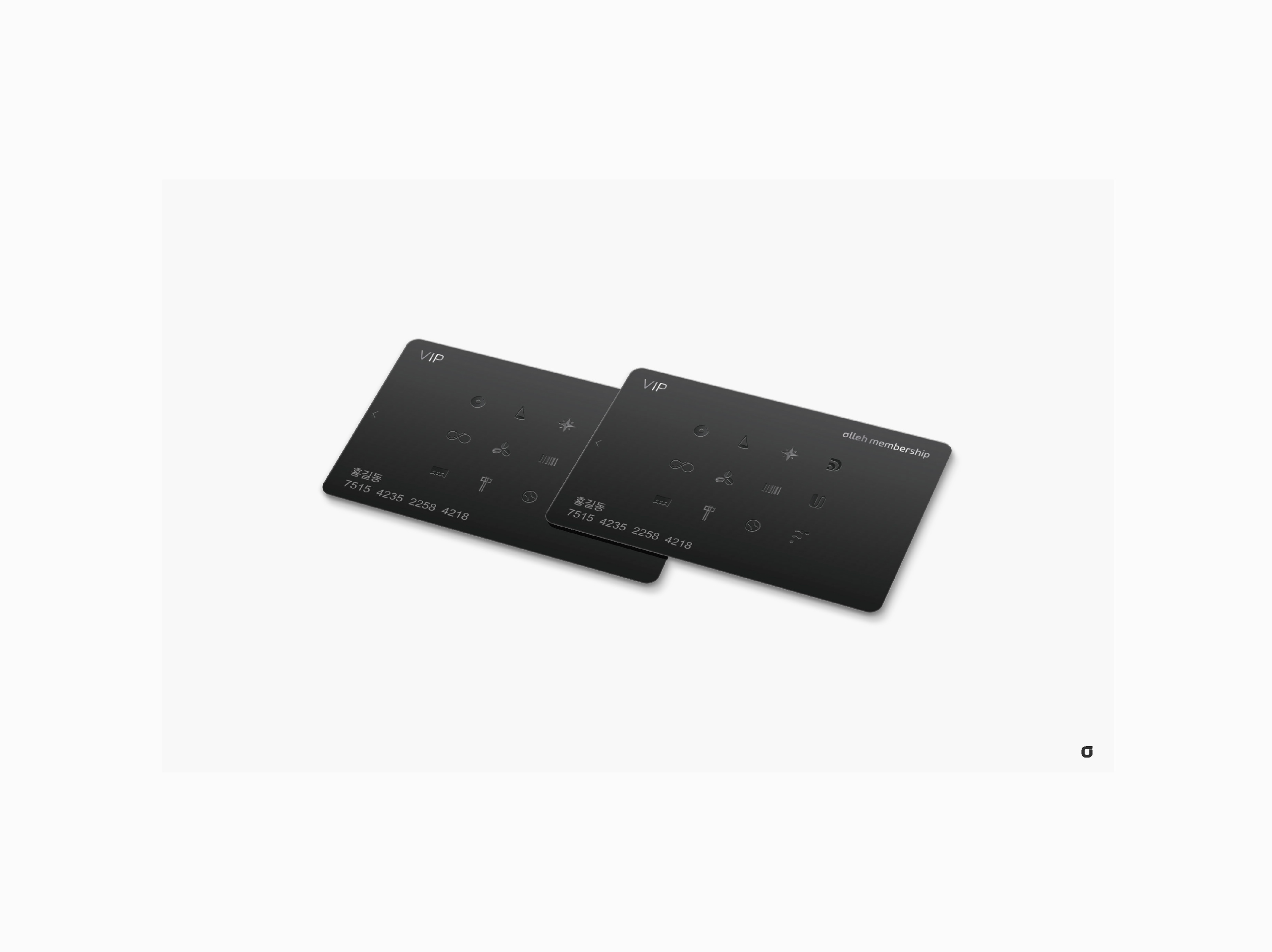
KT Olleh Membership - Membership cards
CONTEXT: KT Corporation (주식회사 케이티), formerly Korea Telecom, is a South Korean telecommunications company.
KT Corporation (KT) is a South Korean telecommunications company and one of the largest in the country, it was founded in 1981 as Korea Telecom and was privatized in 2001.
KT offers a variety of telecommunications services, including mobile wireless, fixed-line, broadband internet, and pay TV, the company also has a growing presence in other businesses, such as cloud computing, media and content, and smart city solutions.
KT is the second-largest mobile carrier in South Korea, with over 28 million subscribers, the company offers a variety of mobile wireless plans, including 5G service.
KT Corporation is a leading player in the South Korean telecommunications market and is expanding its presence in other businesses, the company is well-positioned for continued growth in the years to come.
A branding term, in July 2009, KT Corporation went through a rebranding effort, combining its main brand "KT" with "Olleh," which translates to "connected" or "up and running" in Korean, so "KT Olleh" was essentially a marketing term used for a period of time to represent the newly combined entity.

KT Olleh Membership - Pattern with icons, stickers examples, luxury shopping bag

KT Olleh Membership - New icons (Karim Rashid style) for the Olleh membership card - The idea was to play the icons like only the insiders who own the Olleh membership can understand the code and the meaning of the icons

KT Olleh Membership - Membership cards, teaser banners, eco-bag