Amorepacific Corp. - New RYO rebranding
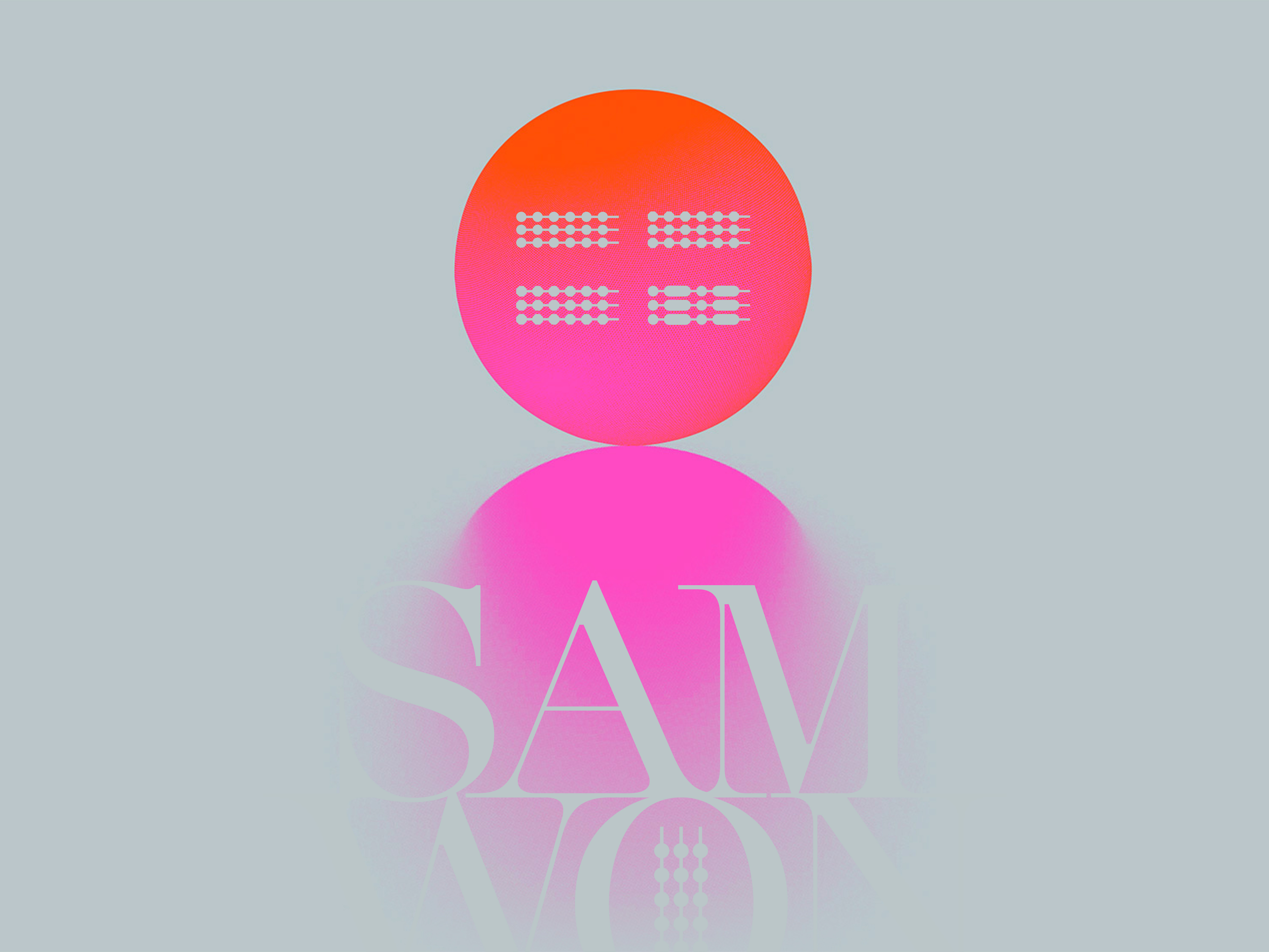
Recline offers a modern aesthetic that balances masculine strength with feminine elegance through its curvy yet structured design.
This duality perfectly aligns with RYO’s diverse audience, catering to both men and women with its natural and contemporary appeal.
As a premium brand specializing in shampoos, conditioners, and hair treatments infused with Korean herbal extracts, RYO needed a typeface that reflected its commitment to quality and innovation.
Recline not only aligns with current market trends but also reinforces RYO’s positioning in the competitive premium haircare market.
Its premium, nature-inspired character underscores the brand’s connection to herbal traditions while projecting a modern sophistication.
This carefully selected font encapsulates RYO’s vision, appealing to a wide audience while showcasing the brand’s dedication to excellence and natural beauty.
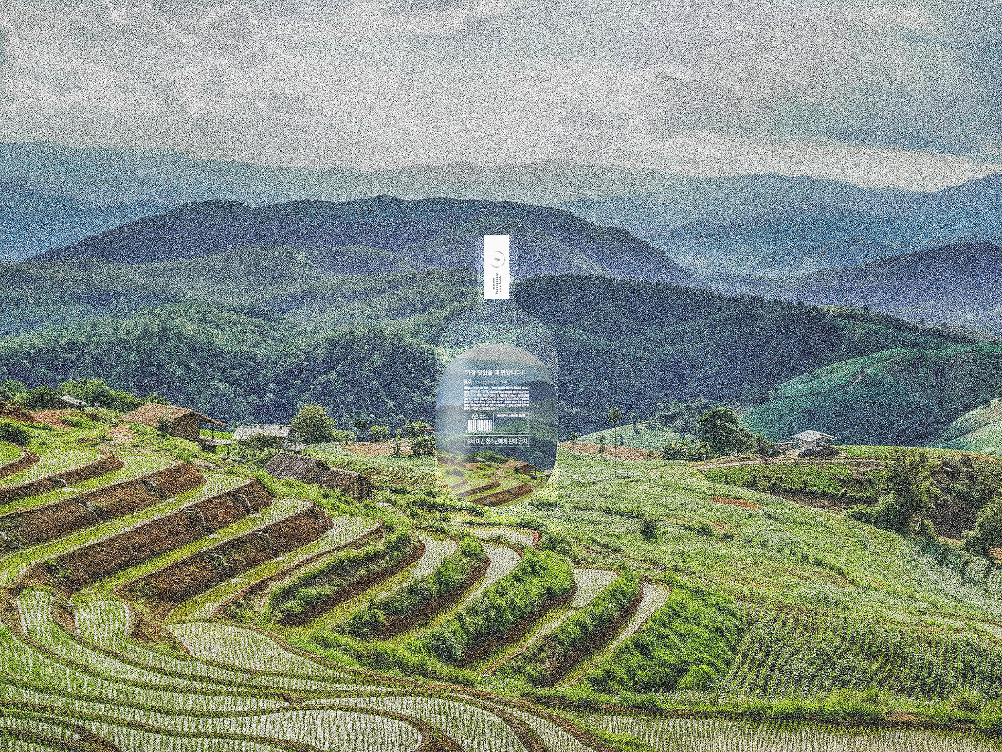
Amorepacific Corp. - New RYO rebranding - 여자에겐. 여자를 위한 탈모샴푸를_정수리 편
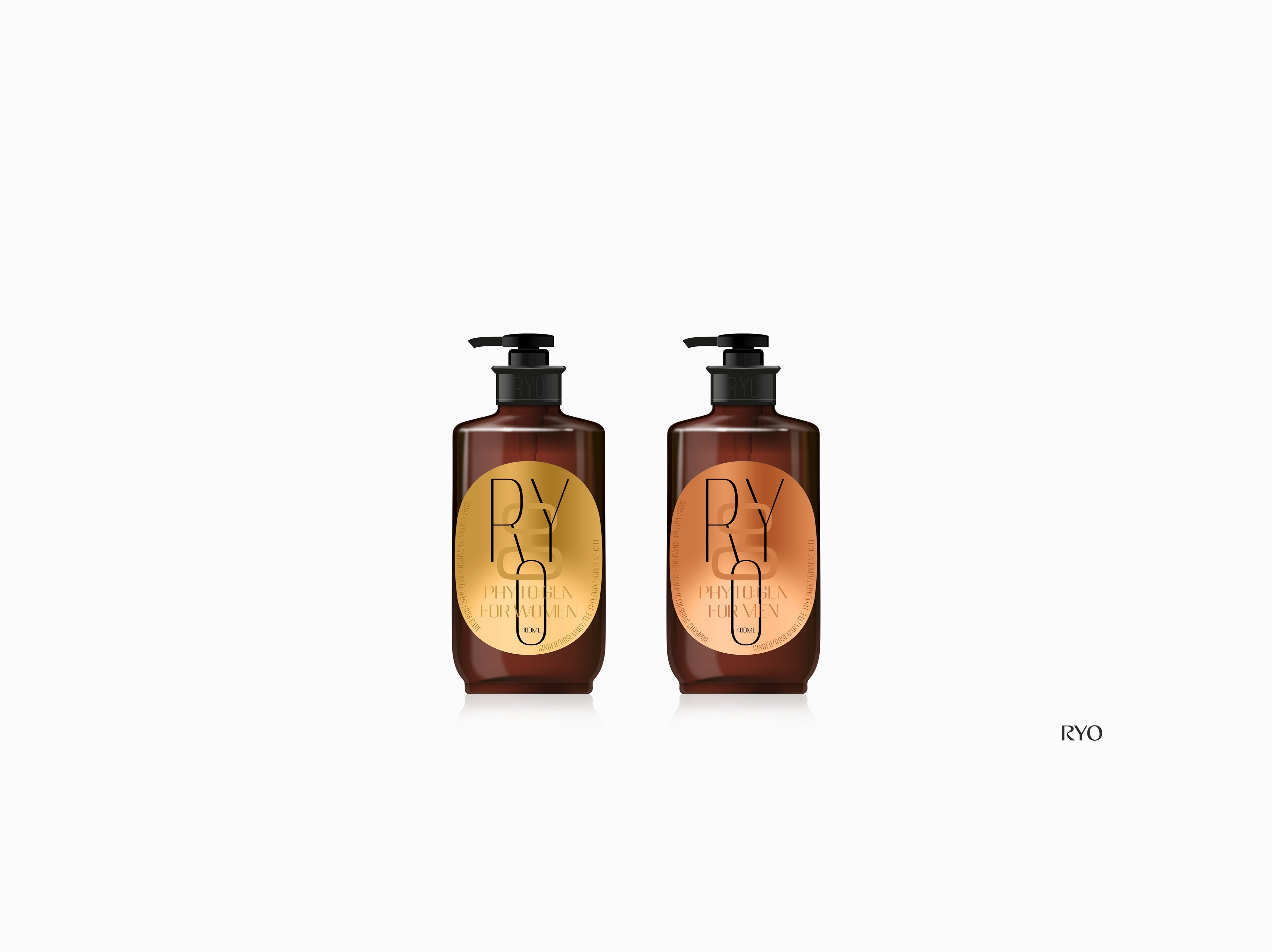
Amorepacific Corp. - RYO rebranding + packaging design (selected version presented to the client)
My initial brief was minimal, with the primary instruction being to "create something similar to the original design."
The goal was to honor the brand’s heritage while showcasing its modernity and commitment to innovation through biotechnology.
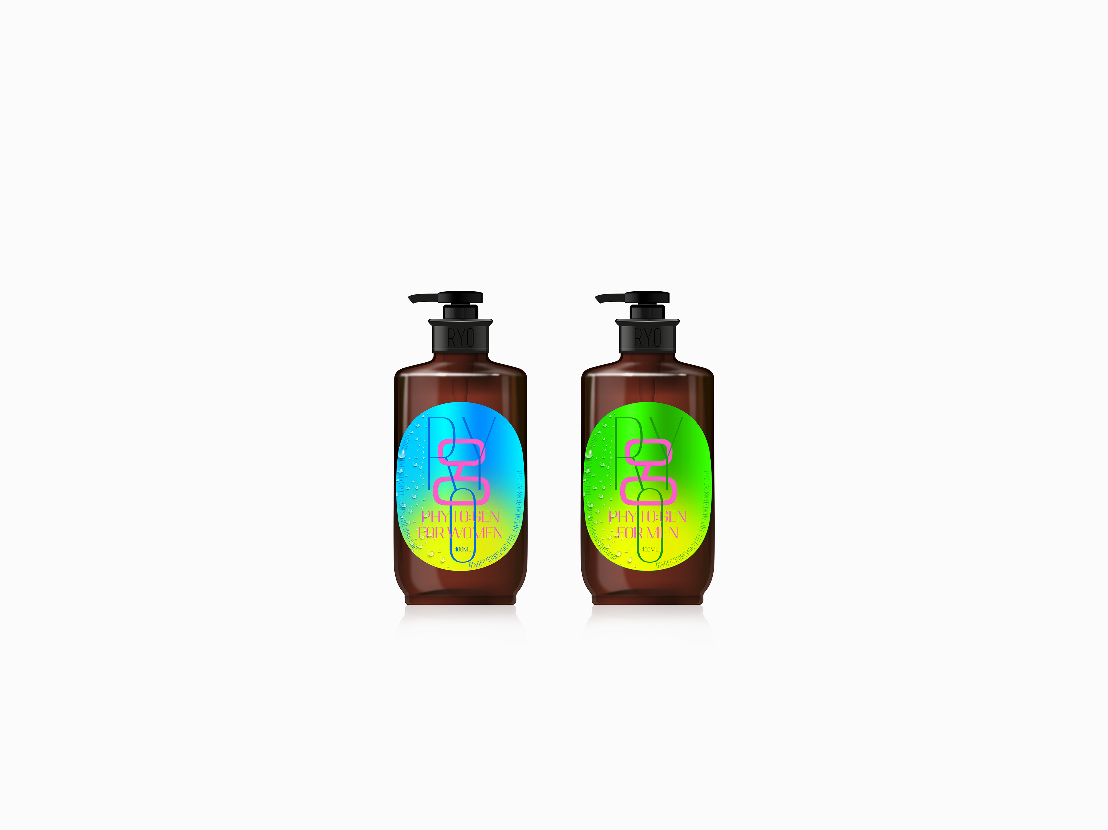
Amorepacific Corp. - RYO rebranding + packaging design (alternative version)
One direction focused on strengthening RYO’s established brand identity, another emphasized its advanced biotechnology processes, and a third highlighted the natural ingredients central to the product line.
Across all concepts, I incorporated modern design elements such as innovative typography and bold color palettes, ensuring the final designs were contemporary while remaining true to the brand's heritage.
Throughout the process, I adhered to the client’s request to maintain either the original brown bottle or explore a new black version, integrating these features seamlessly into the proposed designs.
By taking a strategic and creative approach, I aimed to position RYO’s packaging as a reflection of its premium quality, blending tradition with modern sophistication.
Unfortunately, none of my proposed packaging designs were selected by the client.
The final packaging ultimately chosen remains very similar to the original, with the exception of incorporating elements from RYO's rebranding.

Amorepacific Corp. - RYO packaging design (other direction presented to the client)

Amorepacific Corp. - New RYO rebranding

Amorepacific Corp. - RYO packaging design (other direction presented to the client)

Amorepacific Corp. - RYO packaging design (other direction presented to the client)

Amorepacific Corp. - RYO packaging design (other direction presented to the client)

Amorepacific Corp. - RYO packaging design (other direction presented to the client)


Amorepacific Corp. - RYO branding evolution

Amorepacific Corp. - RYO rebranding - Selected version by the client
Based on Asian ingredients, we seek and provide customized solutions for our customers' hair loss concerns.
Ryo established in 2008, is a distinguished hair loss care brand known for utilizing AmorePacific's advanced scalp research technology, which originated in 1973.
The brand's signature product, ‘Jayangyoonmo’ shampoo, has achieved sustained success not only in Korea but also throughout the ASEAN region.
Recently, 'Ryo' has taken an innovative leap in the realm of premium hair loss care with the debut of the ‘Rootgen’ line, providing personalized care tailored to the distinct causes and symptoms of hair loss in both men and women.