Just like Dorothy's journey to Oz, Factory Oz aims to bring a touch of magic to the creative process, transforming visions into reality for its clients.
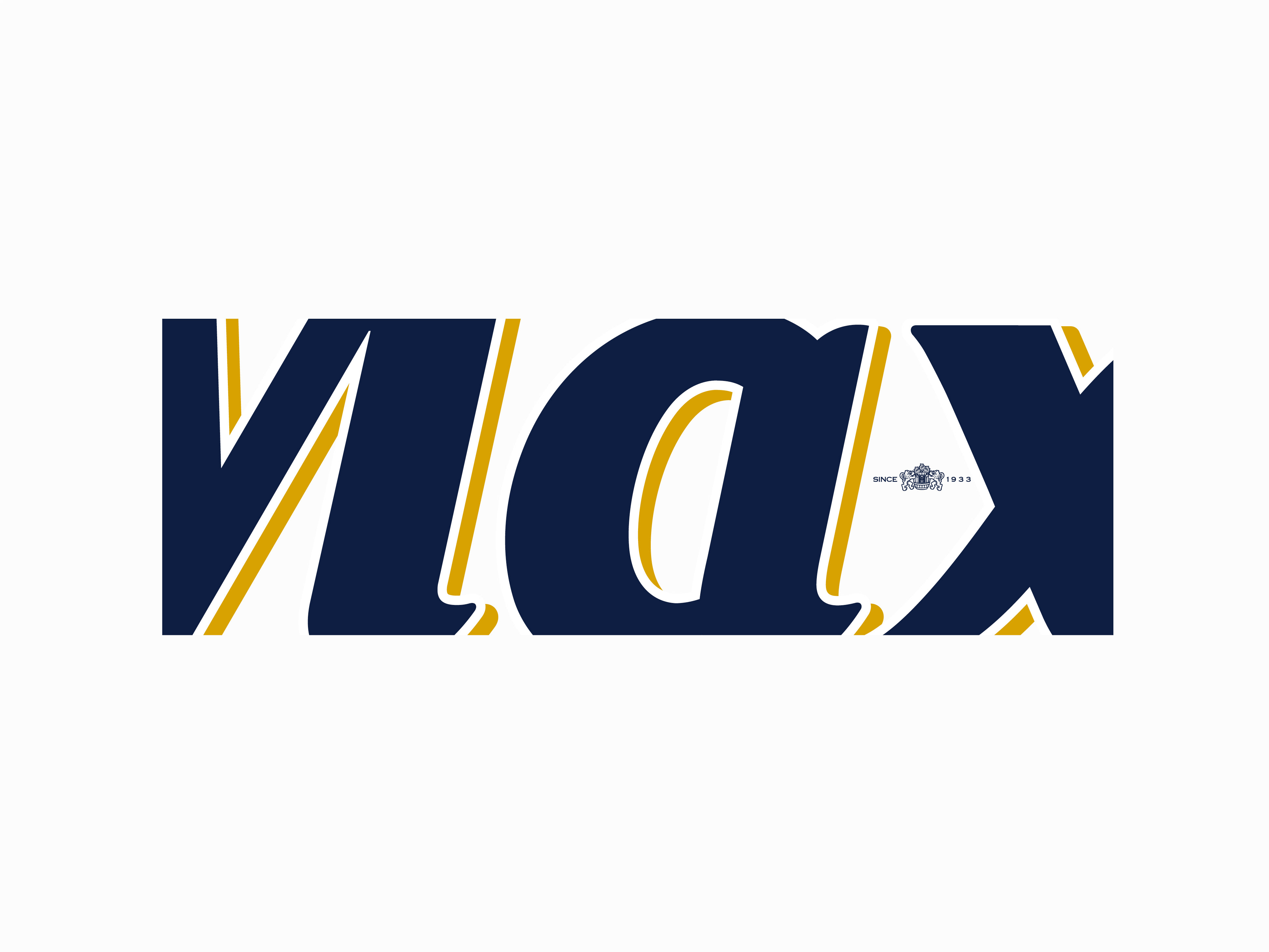
A PALETTE OF POSSIBILITY: the CEO envisioned meaningful branding that captured the essence of their work, bringing magic to the industry and their clients, this magic is inspired by the classic tale, "The Wizard of Oz".
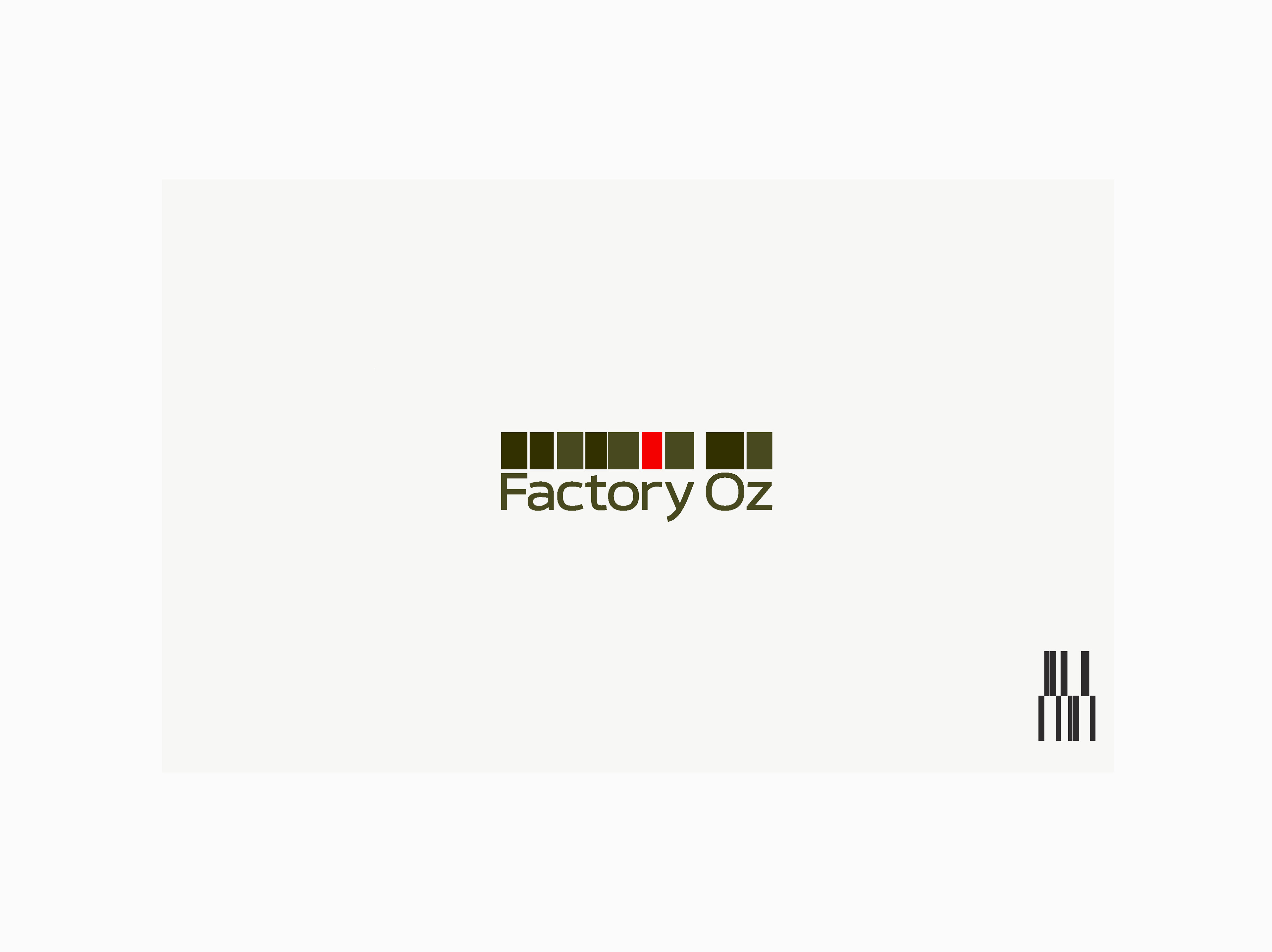
Additionally, a unique color palette built around khaki tones was chosen, these earthy hues evoke a sense of groundedness and stability, while still leaving room for creativity to flourish.
TYPOGRAPHY: Calleo Sans was meticulously chosen as the brand's typeface, this clean and warm font family boasts soft curves, exuding a welcoming and inviting character, its legibility at both small sizes and large headlines makes it incredibly versatile.
Additionally, Calleo Sans possesses a unique "morphing nature", a playful quality that embodies exploration and pushing boundaries, which perfectly aligns with Factory Oz's innovative spirit.
Together, the name, color palette, logo, and font create a brand identity that is both meaningful and memorable.
Factory Oz embodies the magic of transformation, promising its clients a journey where creative dreams become reality, in essence, Factory Oz branding embodies a powerful combination: the magic of transformation, the stability of experience, and the boldness of creative exploration.
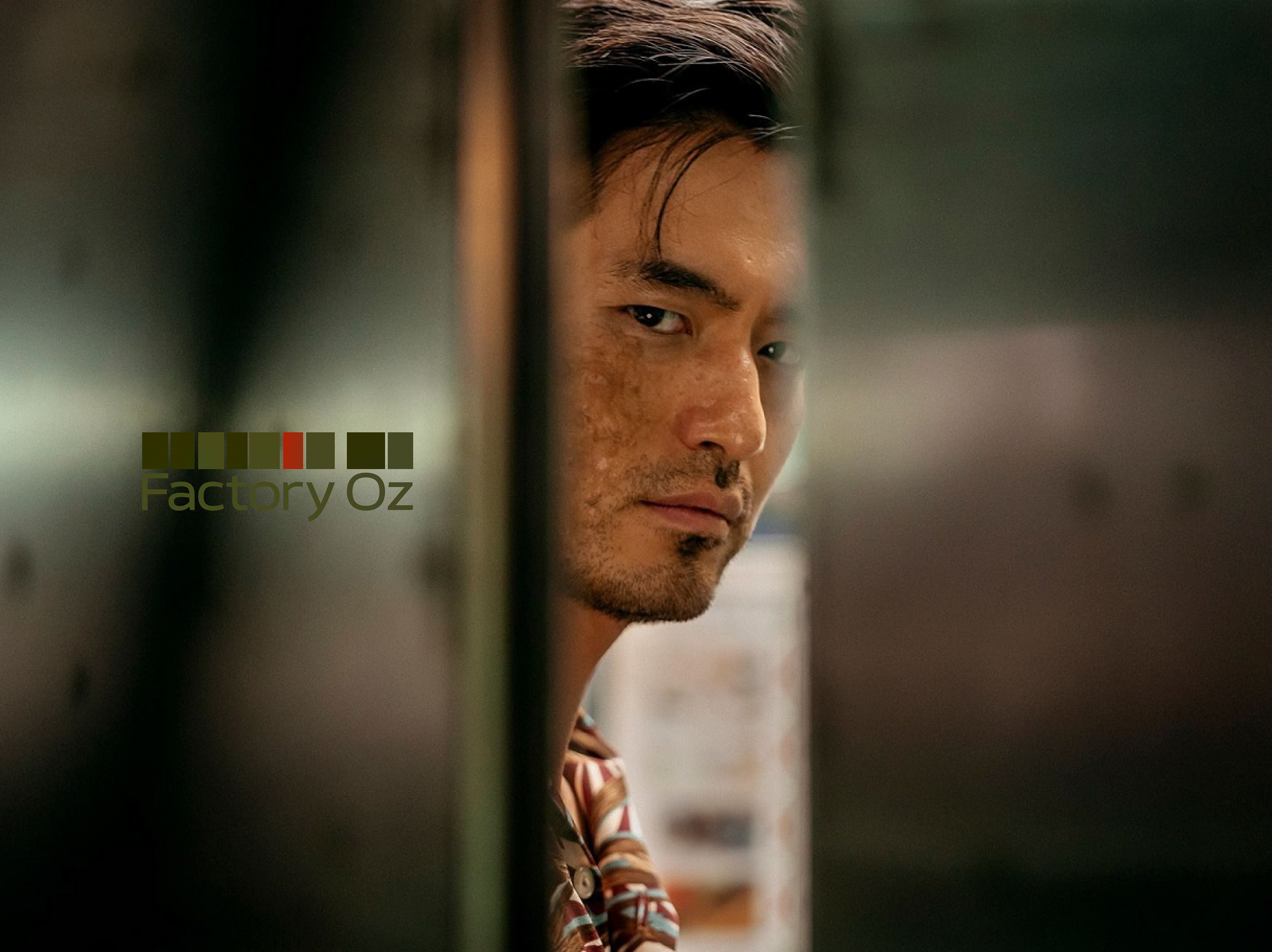
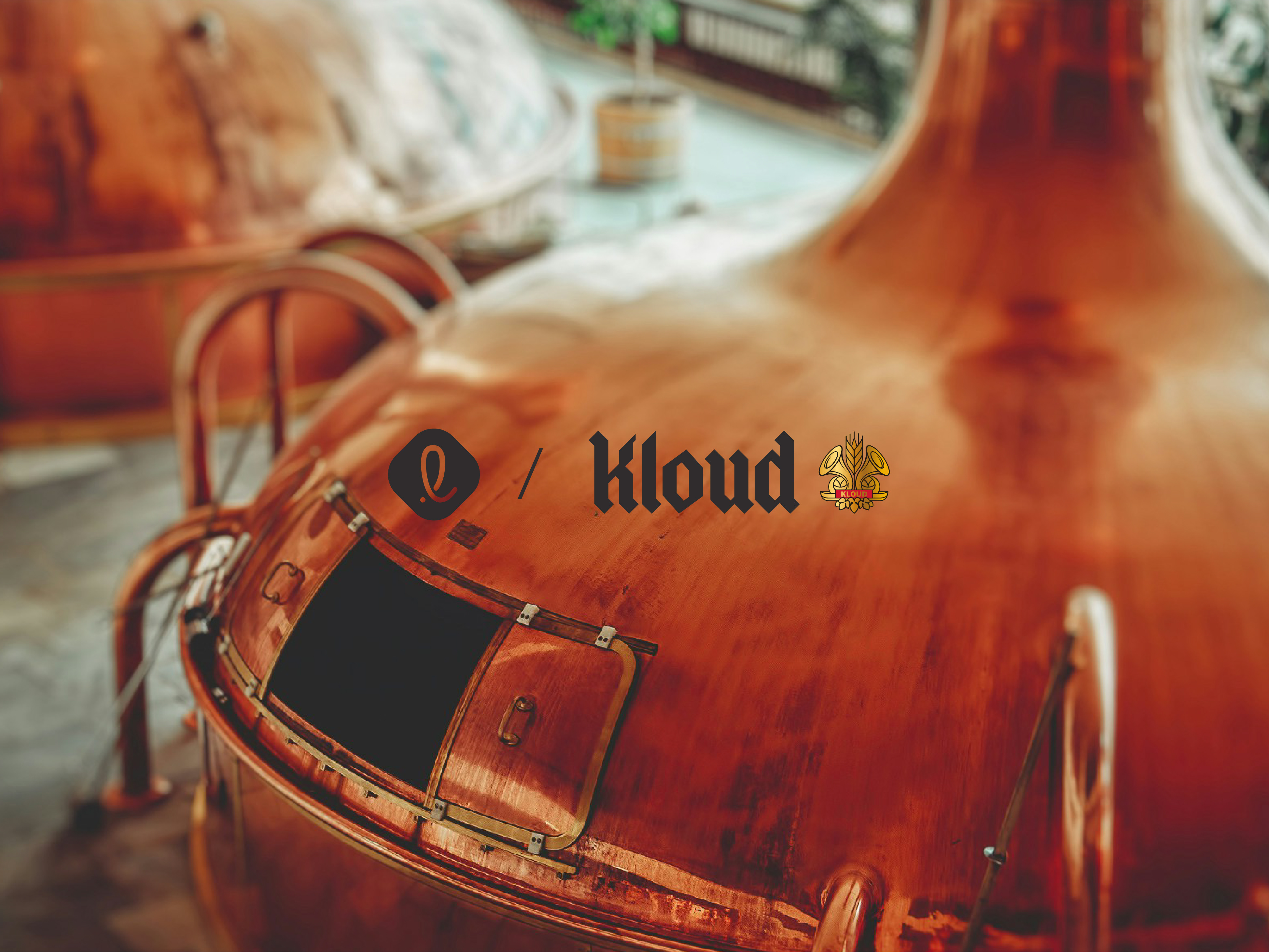
Factory Oz is a post-production & music entertainment company based in Seoul - Sweet home (스위트홈)

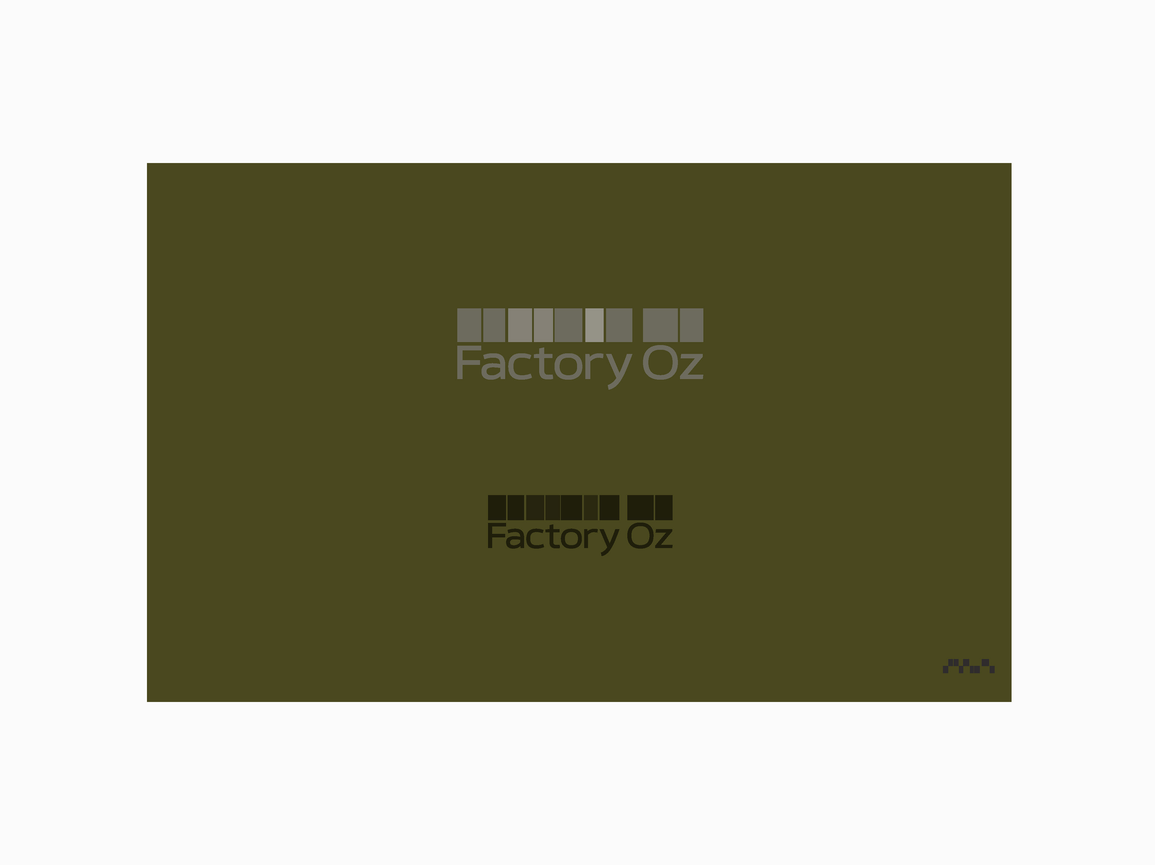
Color variation to Factory Oz branding
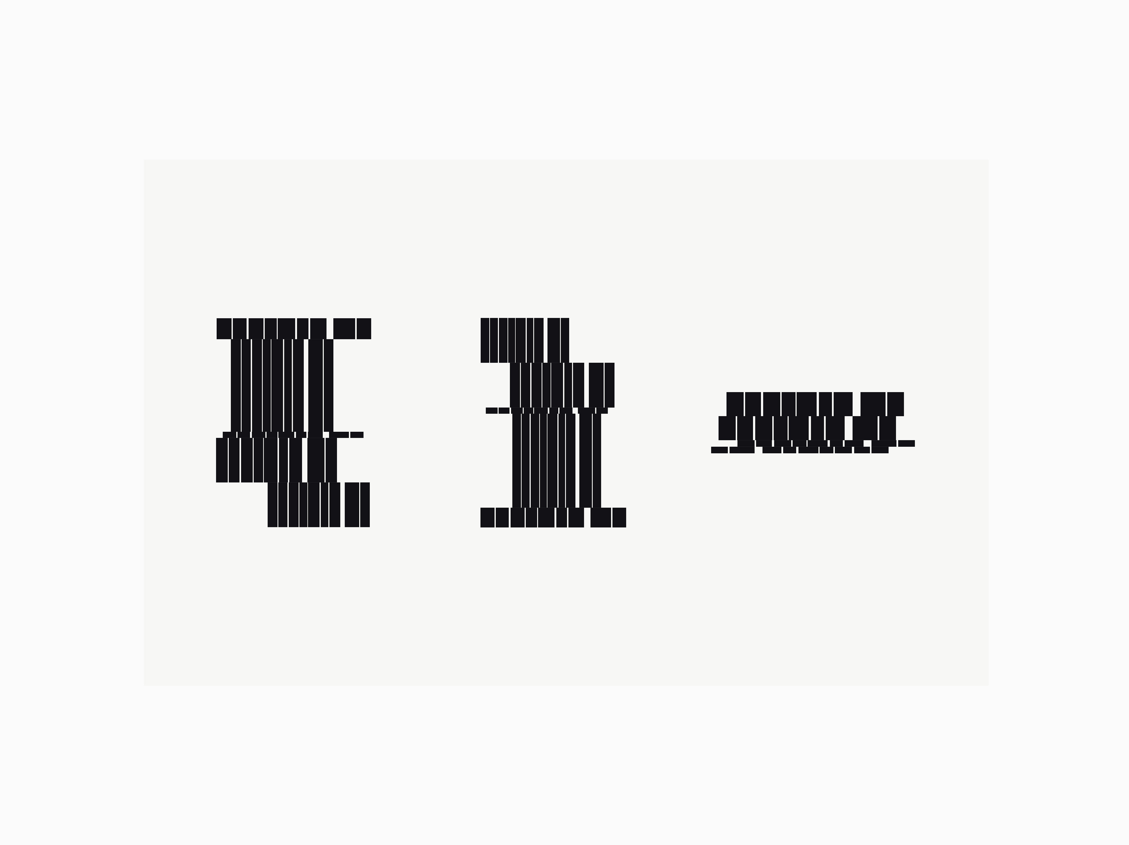
Explanation of Factory Oz branding design
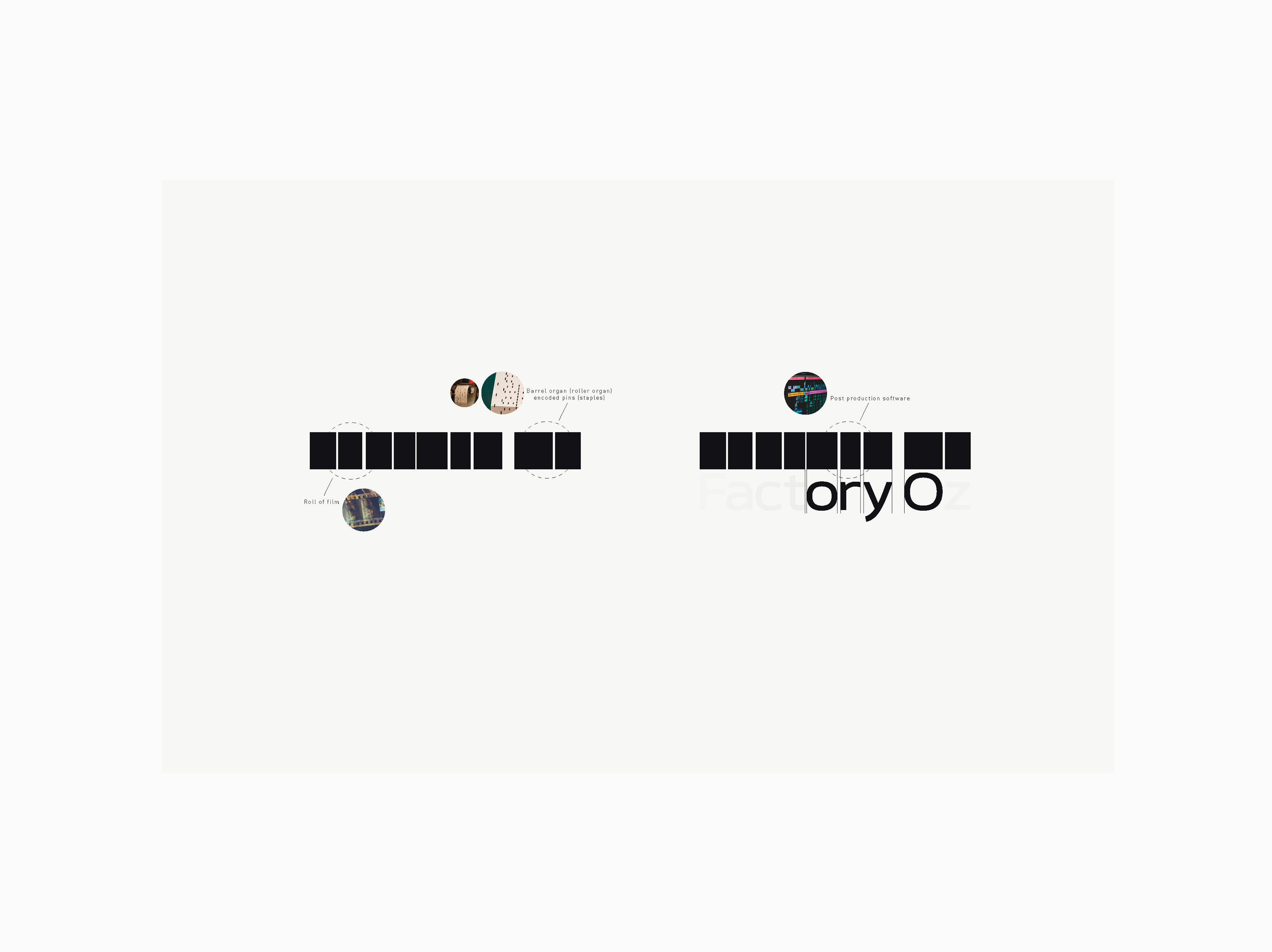
It takes inspiration from the familiar layout of post-production software like Adobe Premiere Pro, Avid Media Composer, or Final Cut Pro X, this is cleverly combined with the visual of a barrel organ (roller organ) encoded pins (staples) and a roll of film.
This unique amalgamation effectively represents the company's core services: post-production, music creation, and entertainment.
The symbol's adaptability ensures a seamless transition across various online and offline platforms.

Applications related to the new logotype

Factory Oz graphic elements
Factory Oz graphic elements
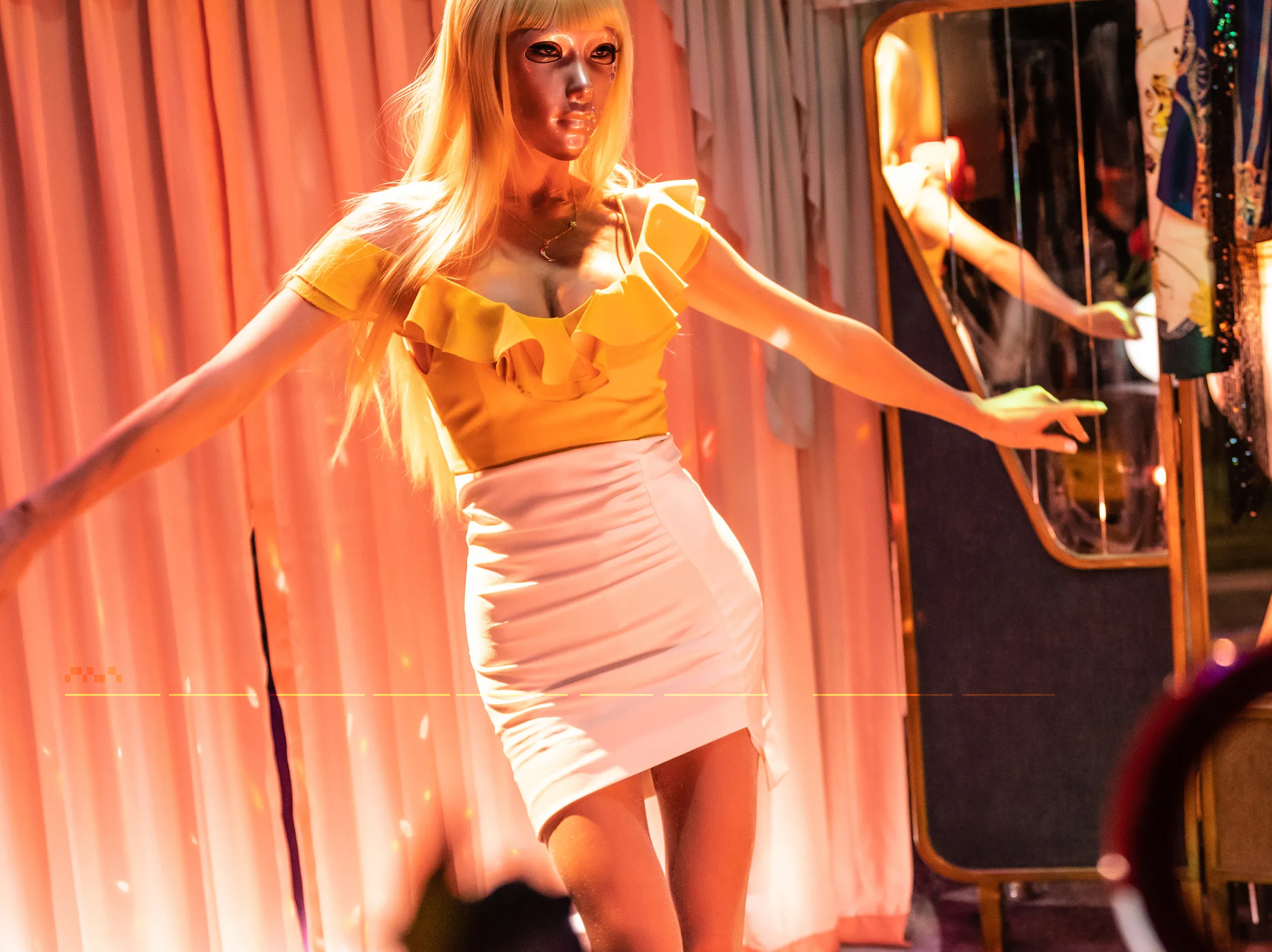
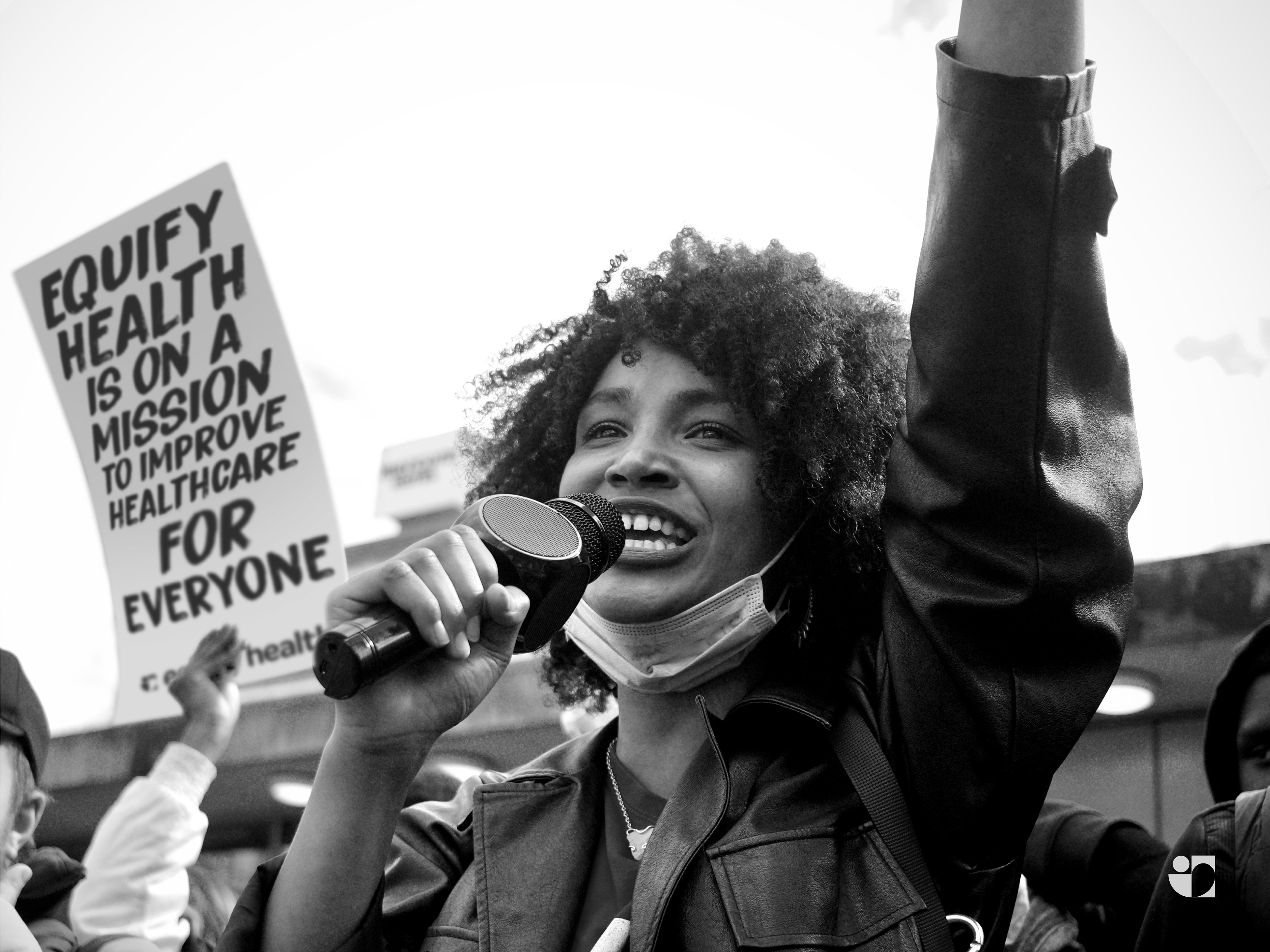
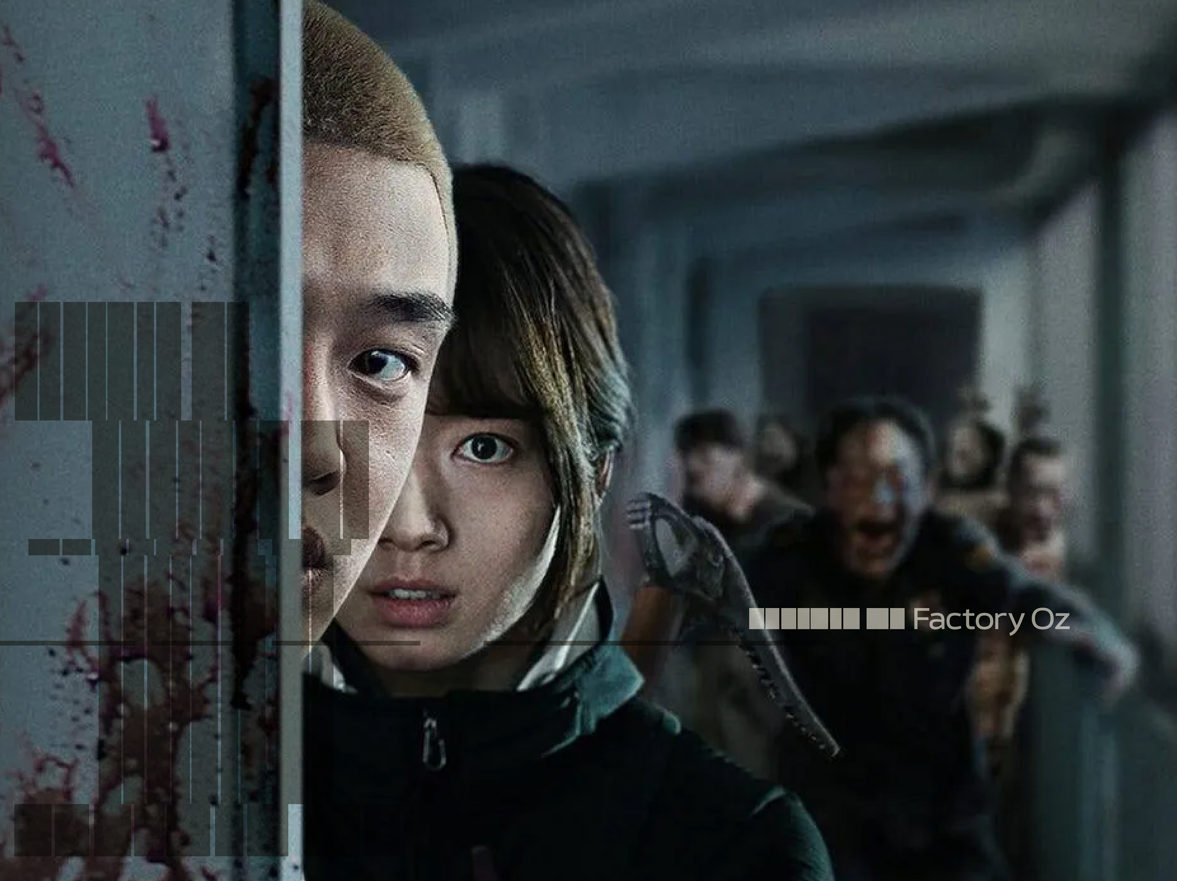
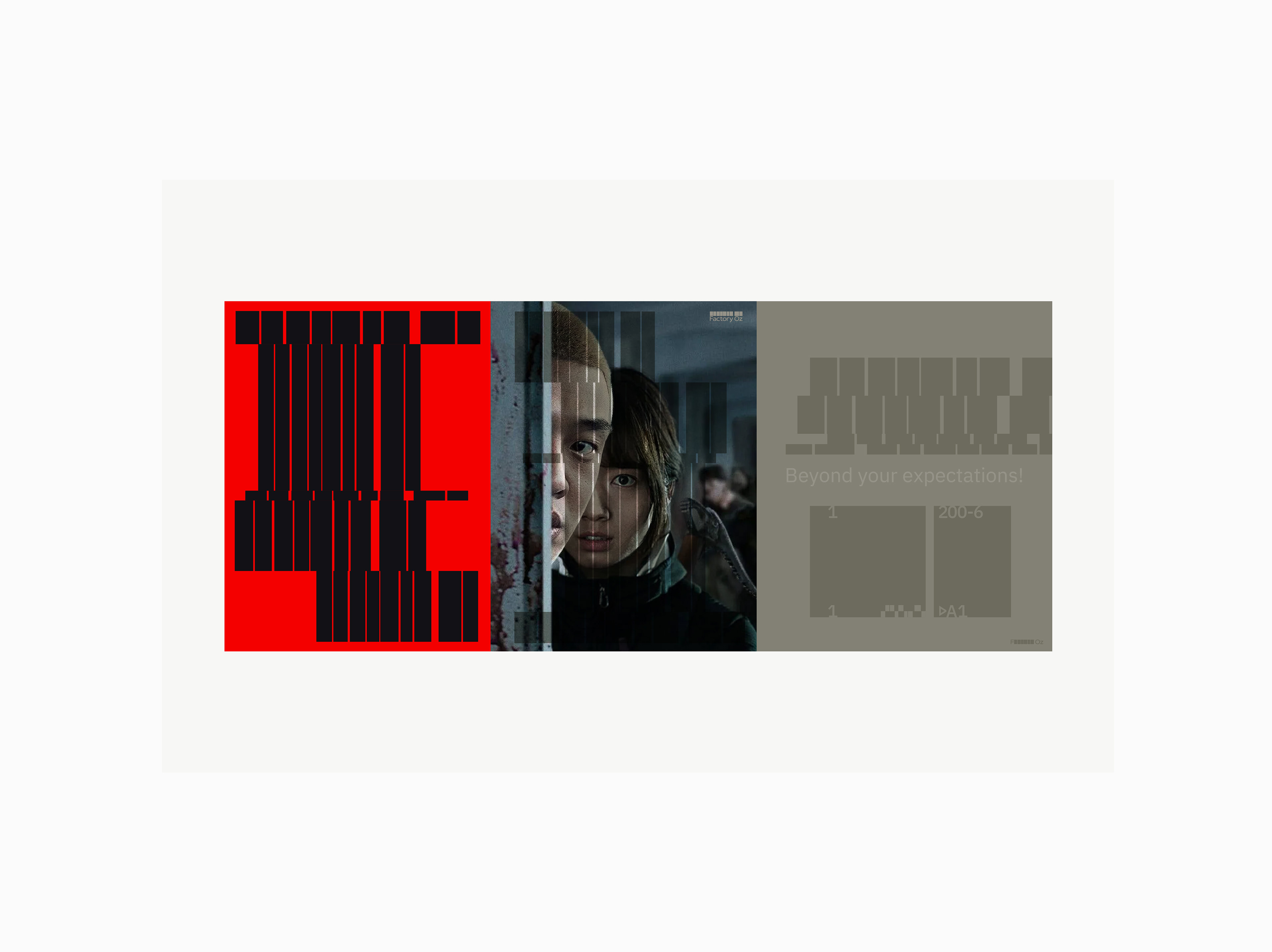
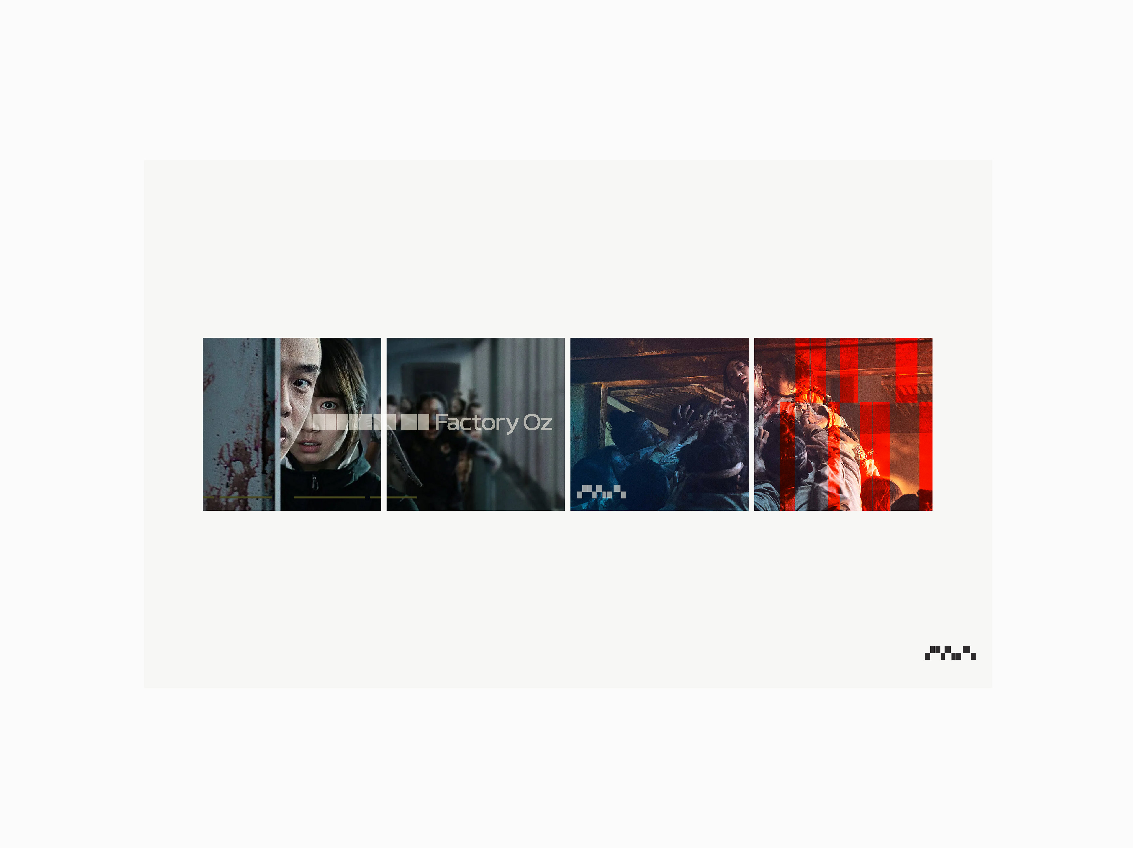
Factory Oz is a post-production & music entertainment company based in Seoul - Mask Girl (마스크걸)

Business cards based on the new logotype
Factory Oz graphic elements
Application of the graphic elements
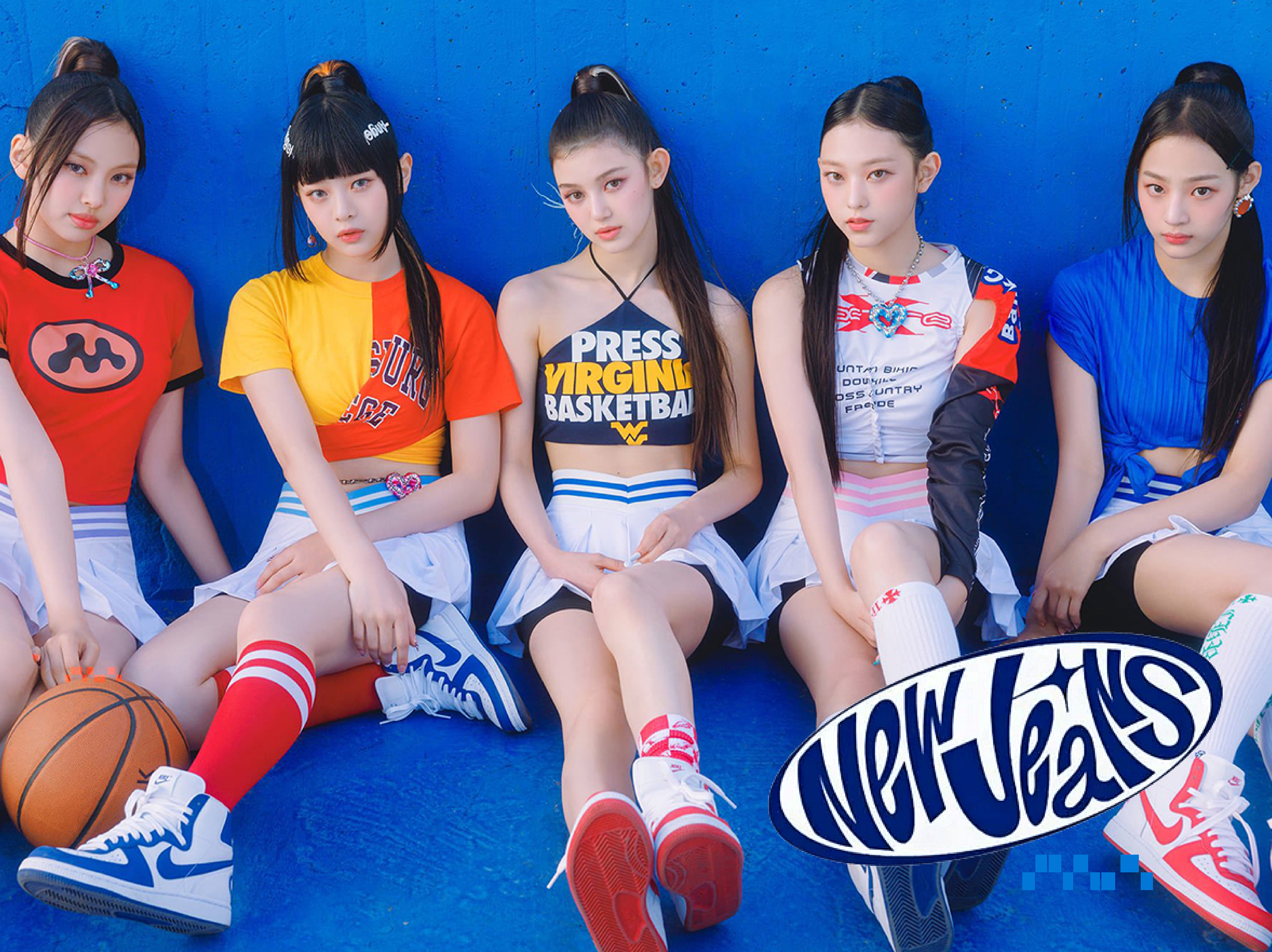
Factory Oz is a post-production & music entertainment company based in Seoul - NewJeans K-Pop girl group (뉴진스)
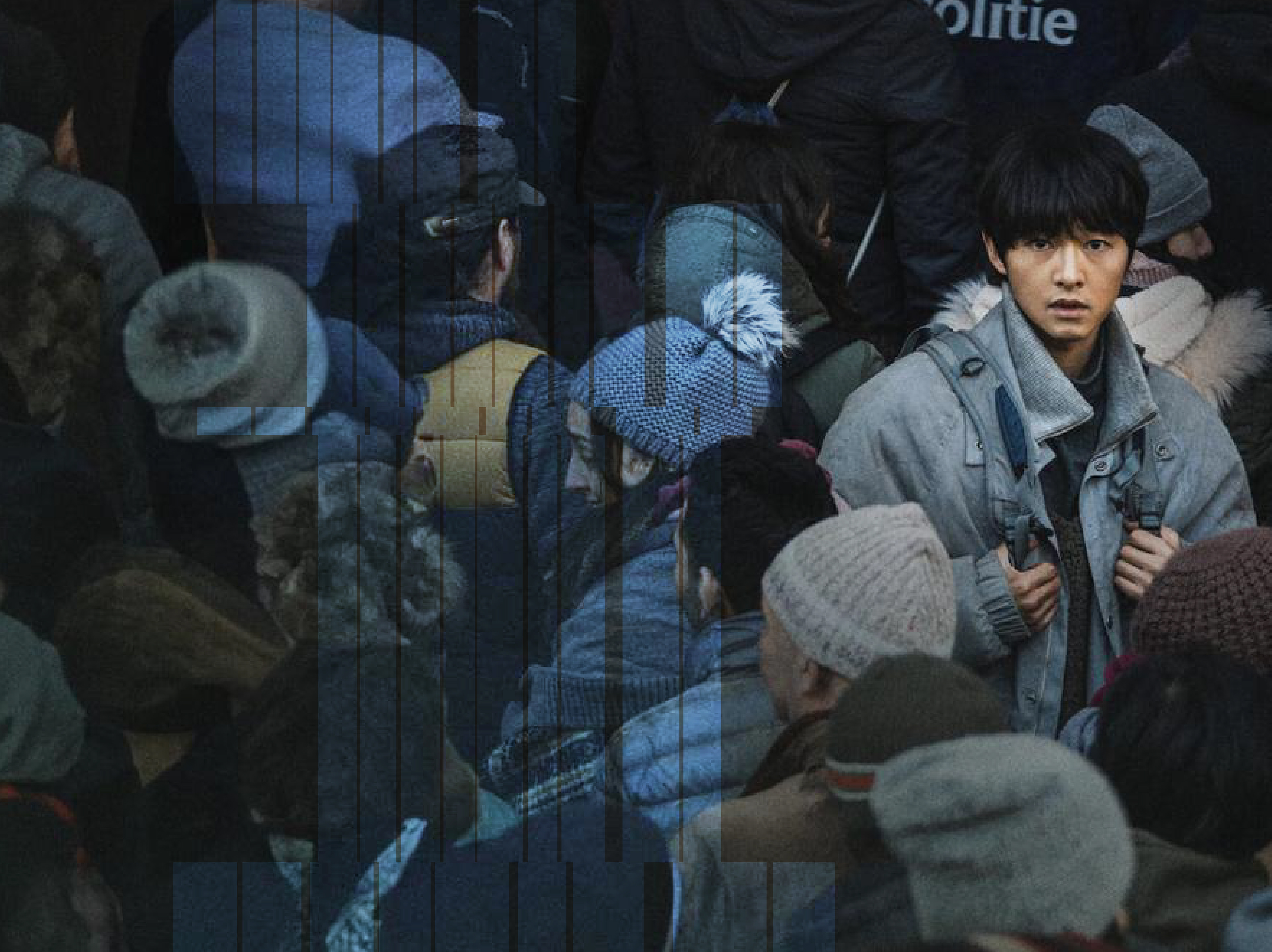
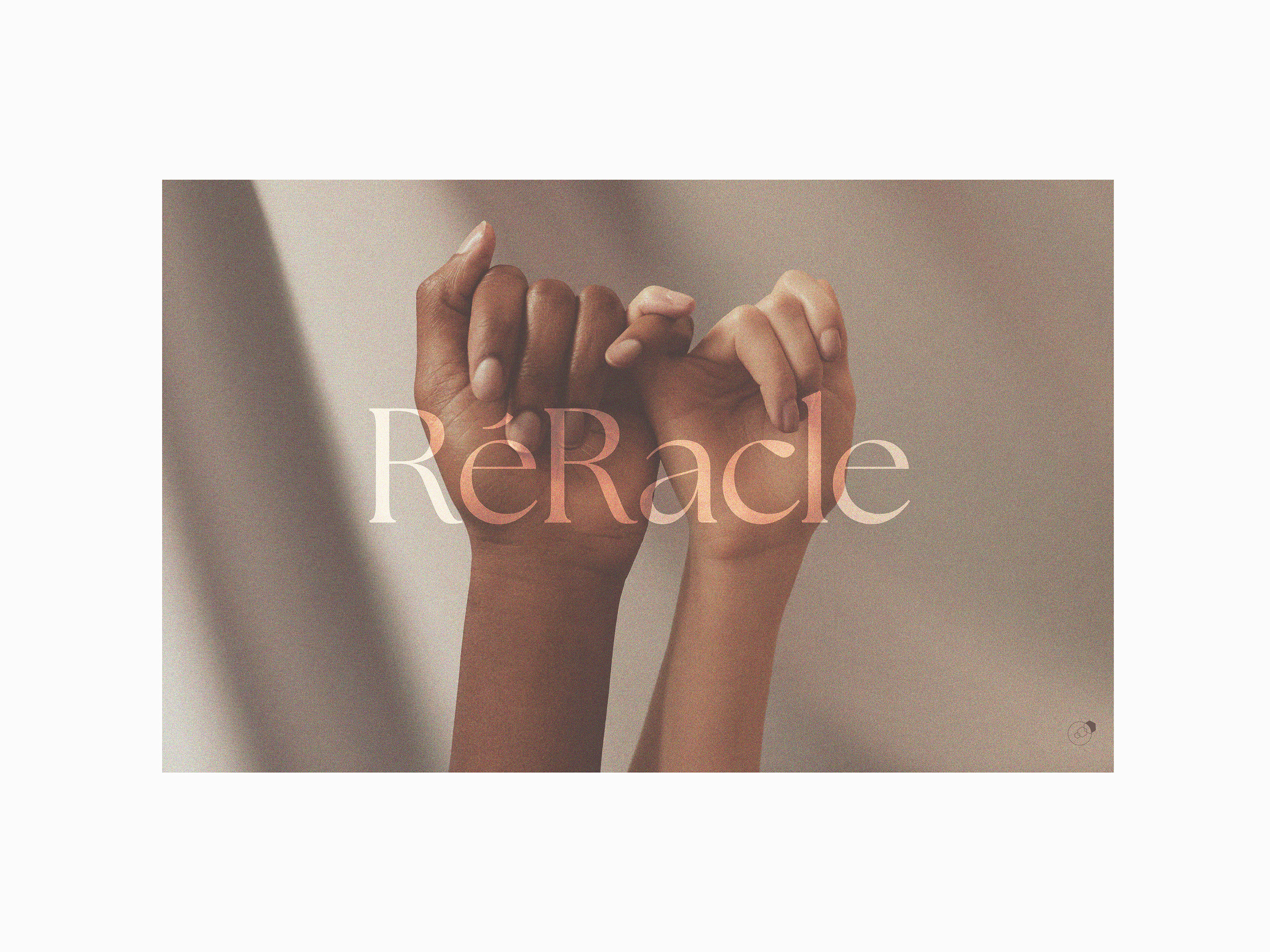
Factory Oz is a post-production & music entertainment company based in Seoul - My Name is Loh Kiwan (로기완)
Color variation to Factory Oz branding
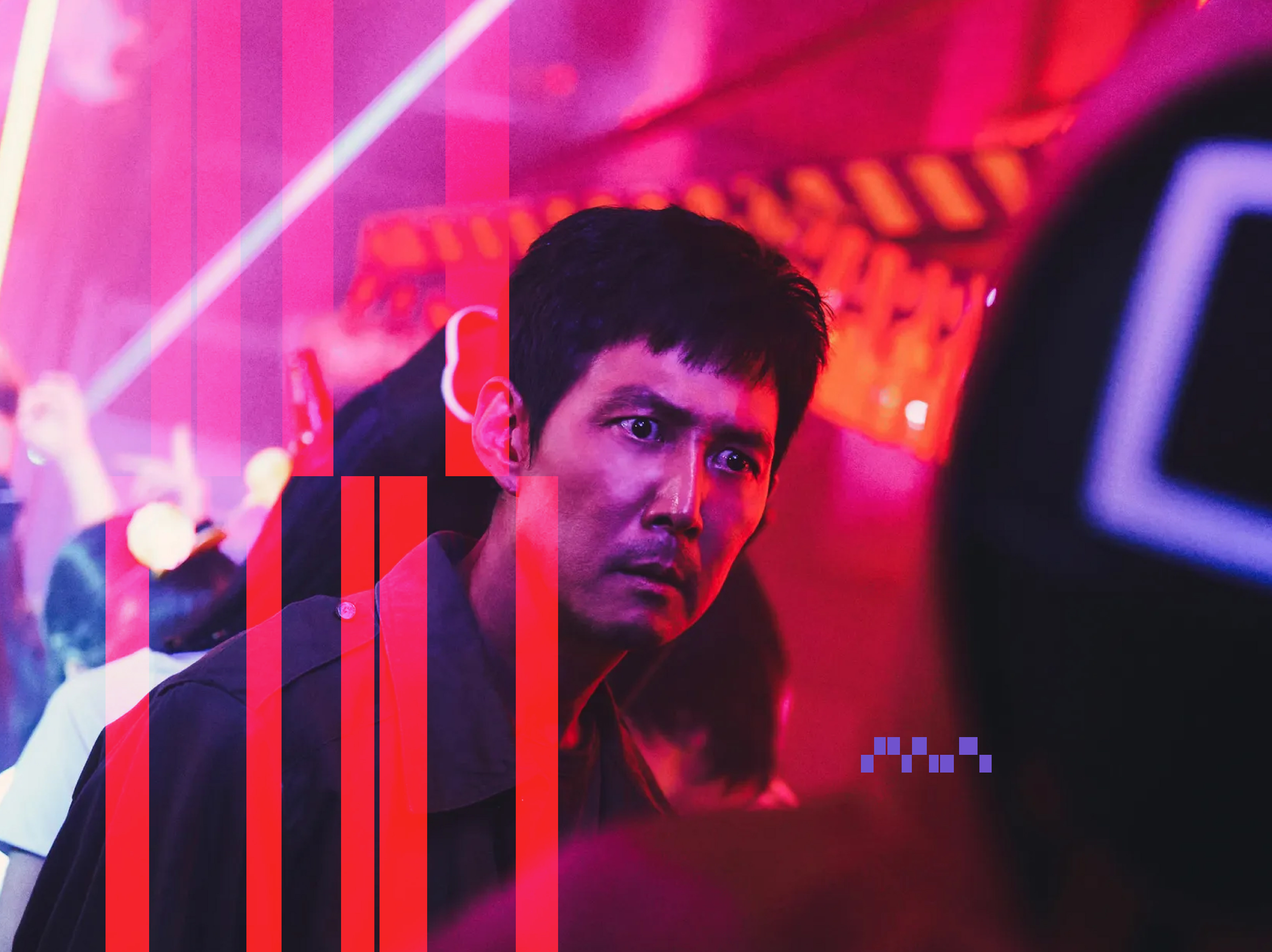
Factory Oz is a post-production & music entertainment company based in Seoul - Squid Game 2 (오징어 게임 2)
Color variation to Factory Oz branding
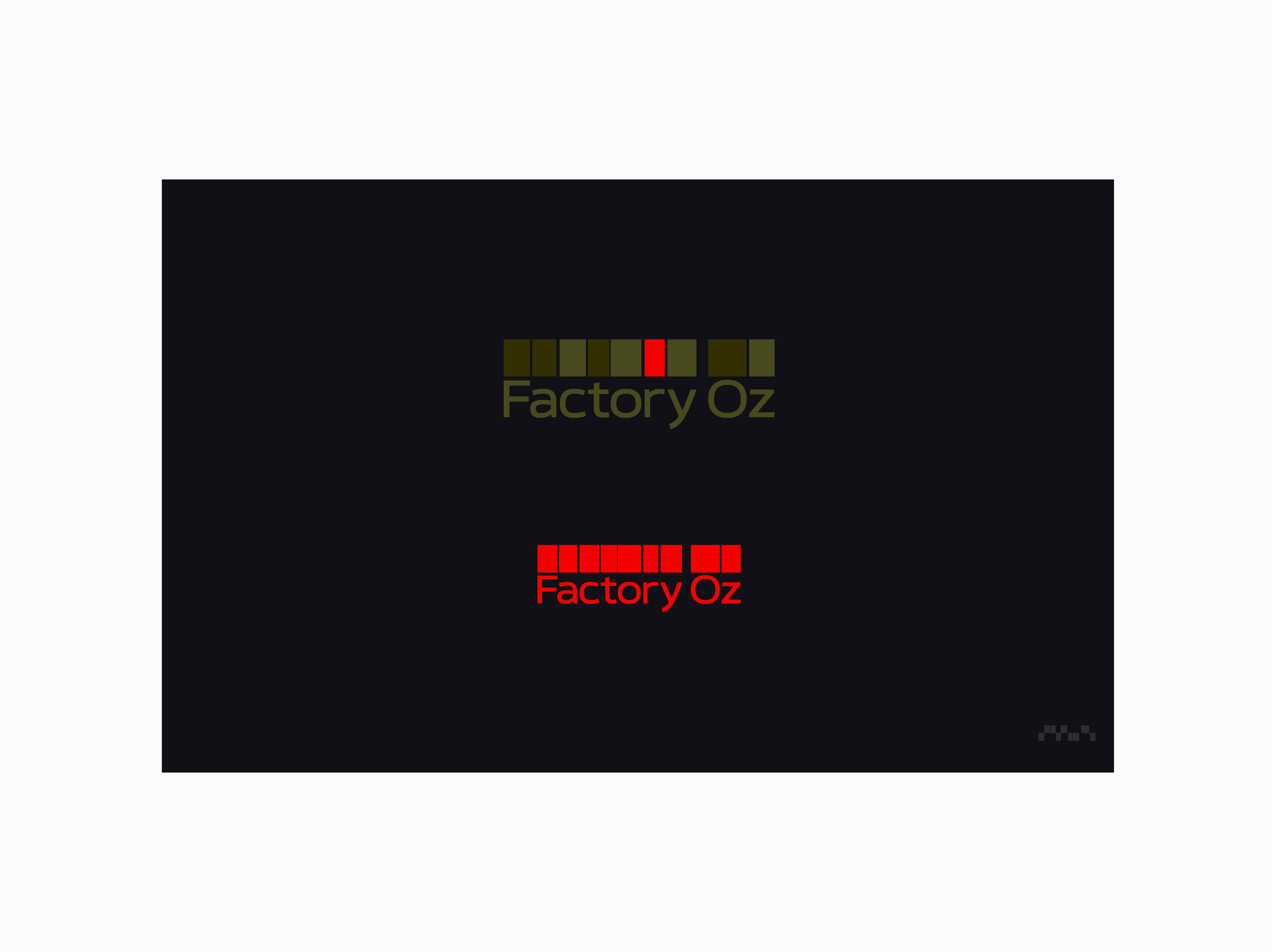
Color variation to Factory Oz branding