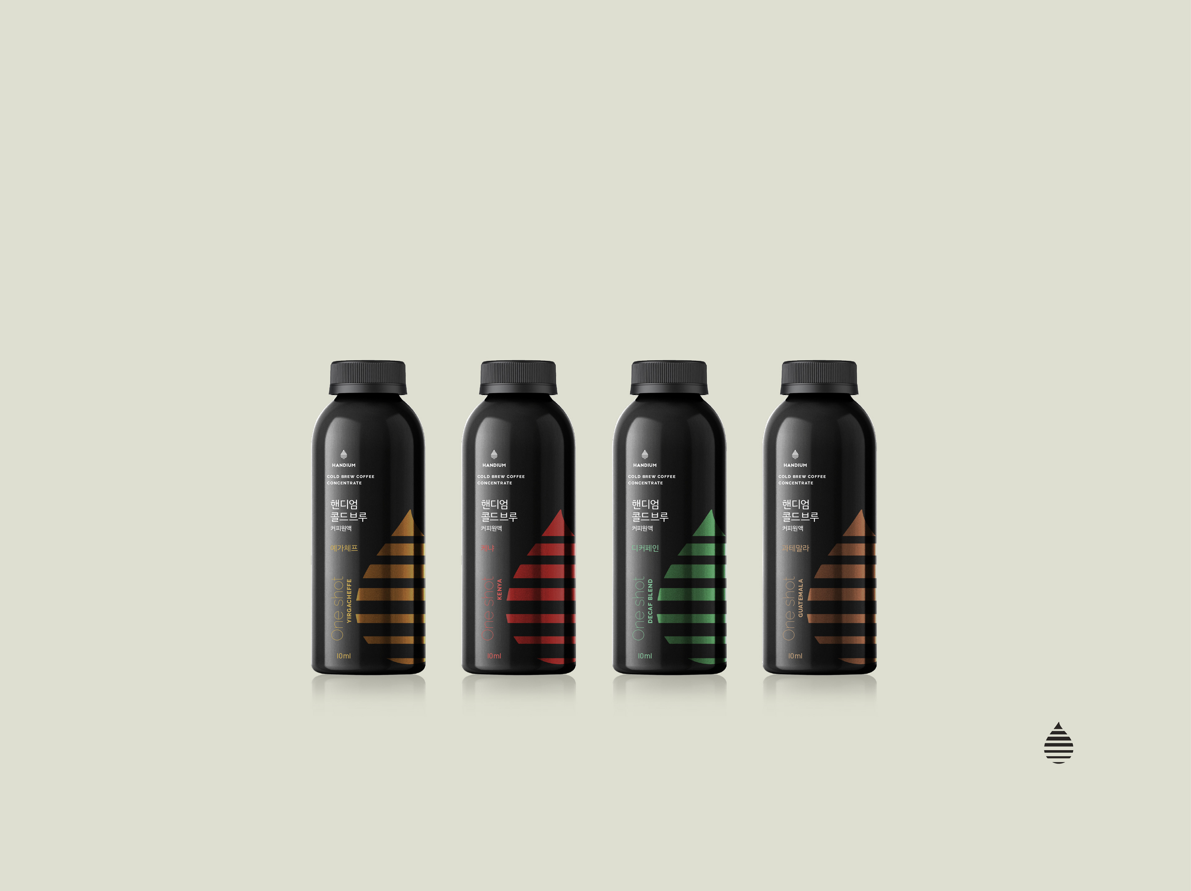
Packaging - concept 1 proposed to Handium - Individual bottles of cold brew coffee concentrate - H1, One shot - Original premium
PACKAGING: for Handium H1 One Shot, the packaging design introduces a bold ultra-minimalist and premium aesthetic, created for coffee enthusiasts seeking both convenience and refinement.
As Senior Art Director, I translated Handium’s core values of handcrafted excellence and transparency into a clean typographic system and a minimalist symbol reflecting the brand’s artisanal DNA.
The range features single-use 10ml cold brew concentrate bottles, precisely designed for one Americano, iced latte, or double espresso.
The visual concept is built around a magnified coffee drop, symbolizing purity, concentration, and the essence of Handium’s craft.
Transparent bottles reinforce brand openness, while hot foil–printed drops in distinct colors differentiate four premium and two ultra-premium flavors, creating a strong contrast against the dark bottle for maximum visual impact.
I initially presented this concept in 2021 to Handium’s CEO; although it was not finalized at the time, I can now in 2025, see that the core idea has been implemented in Handium’s latest release (click on the above image).
As Senior Art Director, I translated Handium’s core values of handcrafted excellence and transparency into a clean typographic system and a minimalist symbol reflecting the brand’s artisanal DNA.
The range features single-use 10ml cold brew concentrate bottles, precisely designed for one Americano, iced latte, or double espresso.
The visual concept is built around a magnified coffee drop, symbolizing purity, concentration, and the essence of Handium’s craft.
Transparent bottles reinforce brand openness, while hot foil–printed drops in distinct colors differentiate four premium and two ultra-premium flavors, creating a strong contrast against the dark bottle for maximum visual impact.
I initially presented this concept in 2021 to Handium’s CEO; although it was not finalized at the time, I can now in 2025, see that the core idea has been implemented in Handium’s latest release (click on the above image).
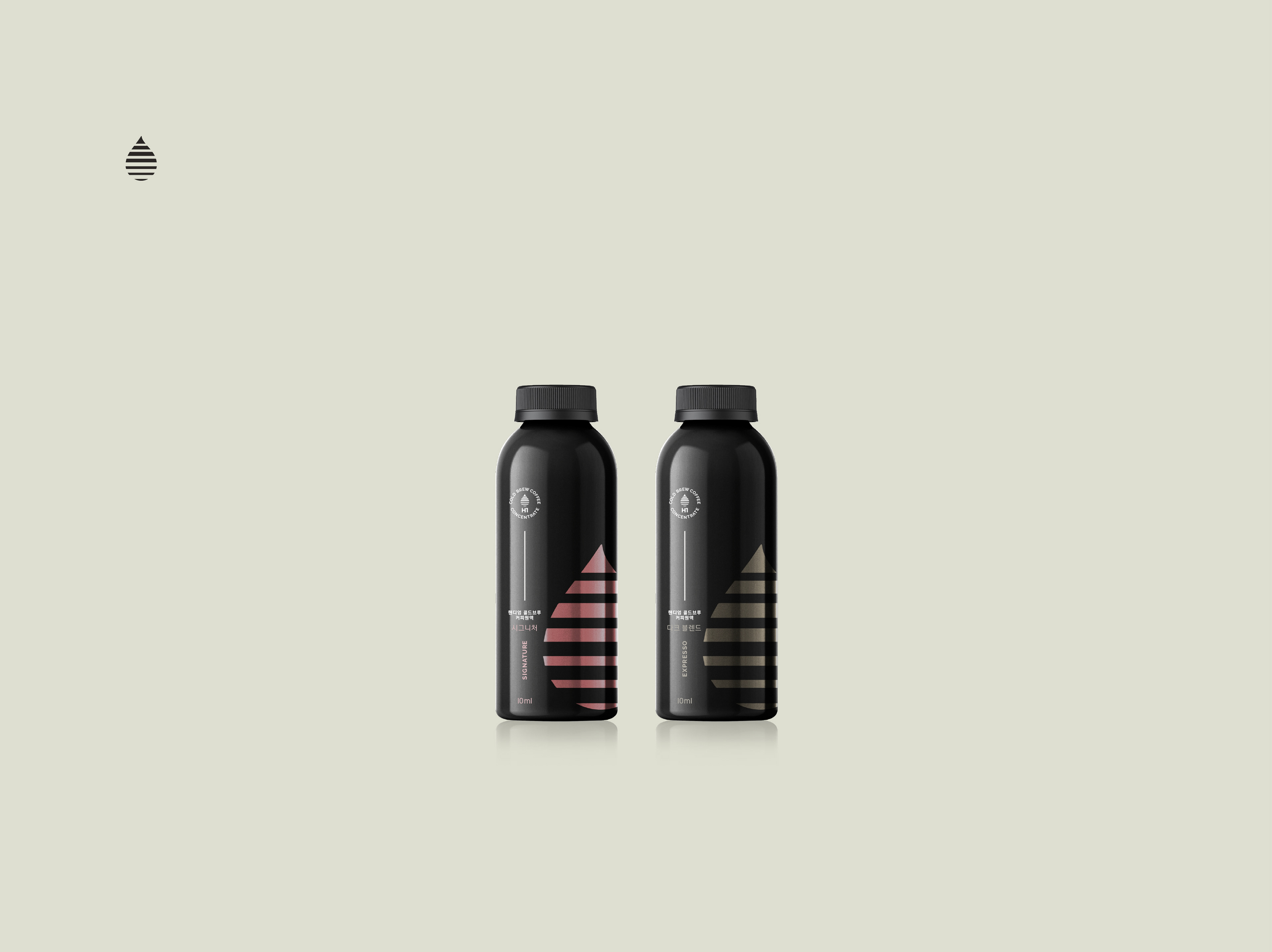
Packaging - concept 1 proposed to Handium - Individual bottles of cold brew coffee concentrate - H1, One shot - Original premium
I initially presented this concept in 2021 to Handium’s CEO; although it was not finalized at the time, I can now in 2025, see that the core idea has been implemented in Handium’s latest release (click on the above image).
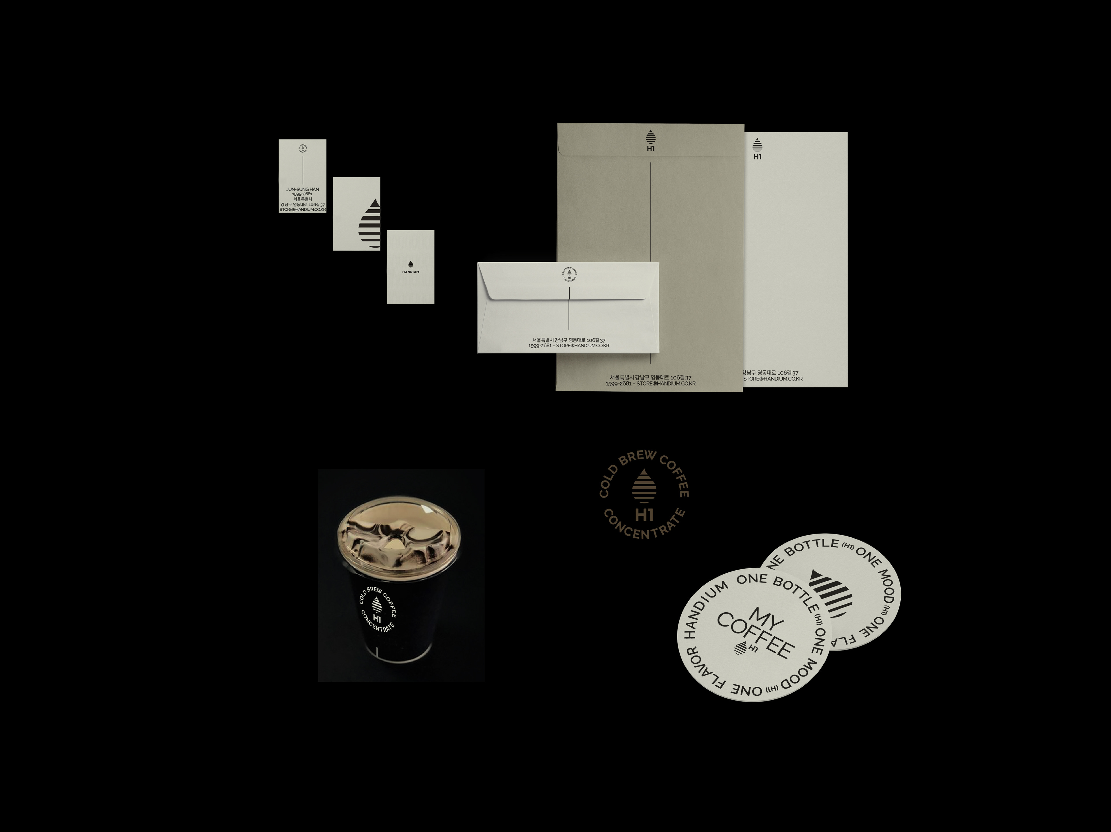
Handium Coffee Roasters - Brand identity for those individual bottles of cold brew coffee concentrate
BRAND IDENTITY: in addition, I developed a minimalist brand identity for supporting materials, including business cards, envelopes, posters, paper cups, and coasters.
The visual identity uses a custom symbol that combines the drop with the H1 branding, extending the premium feel of the packaging across all touchpoints.
This cohesive visual system ensures that the bold simplicity and handcrafted essence of Handium are conveyed consistently, from the product packaging to the customer’s in-store experience.
The visual identity uses a custom symbol that combines the drop with the H1 branding, extending the premium feel of the packaging across all touchpoints.
This cohesive visual system ensures that the bold simplicity and handcrafted essence of Handium are conveyed consistently, from the product packaging to the customer’s in-store experience.
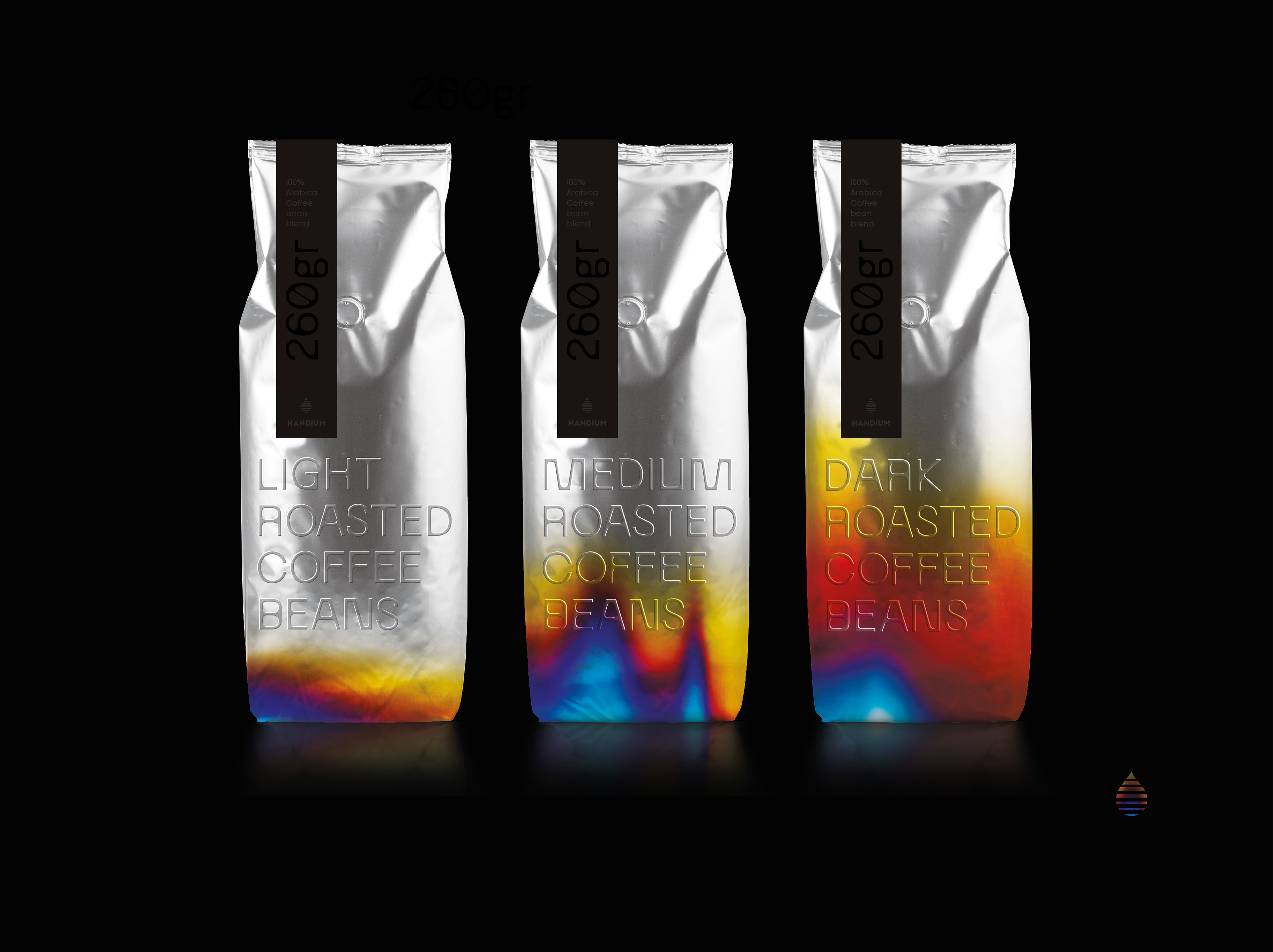
Packaging - concept 2 proposed to Handium - Light, medium, dark roasted coffee beans
PACKAGING: a concept based on aluminum pouches treated with varying heat levels to visually represent roasting intensity.
The result is a bold, meaningful, and highly impactful design with a refined, sophisticated presence.
PACKAGING: a concept based on aluminum pouches treated with varying heat levels to visually represent roasting intensity.
The result is a bold, meaningful, and highly impactful design with a refined, sophisticated presence.
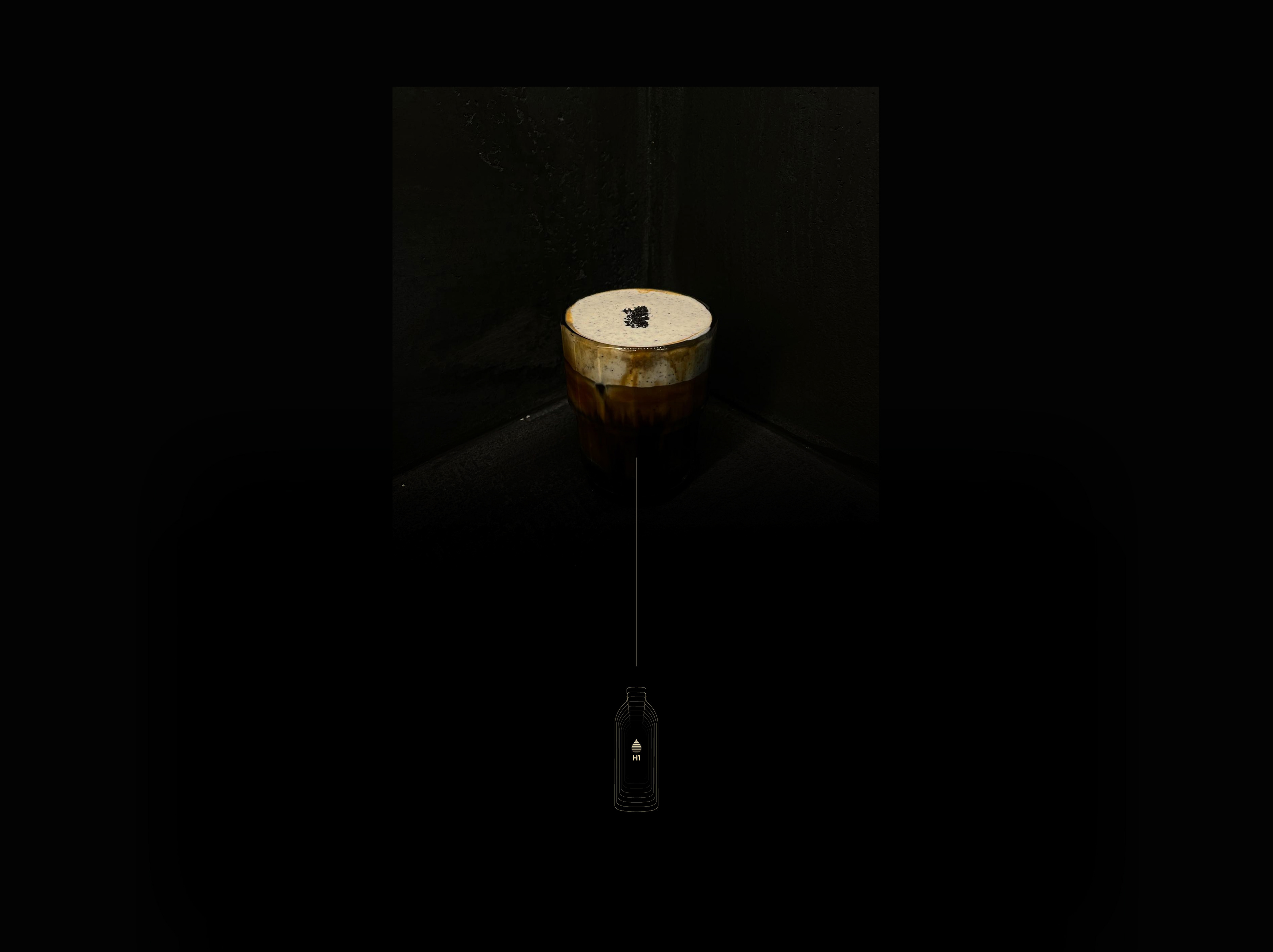
Handium Coffee Roasters - Brand identity for those individual bottles of cold brew coffee concentrate
CONTEXT: Handium stands for "handmade for your premium" (combining 'Hand' from 'Handmade' and 'ium' from 'premium').
This reflects the brand's philosophy of blending artisanal craftsmanship with an unwavering commitment to quality.
At the heart of Handium's mission is the belief that integrating premium experiences into daily life allows individuals to nurture themselves, igniting a passion for continuous self-improvement and discovery.
Every cup of Handium coffee is crafted with meticulous care, seamlessly combining modern brewing techniques with traditional handmade craftsmanship.
From the moment you begin brewing to the final sip, Handium ensures a premium, tailored experience that caters to diverse tastes.
Handium's mission is built on three core principles:
- Craftsmanship, coffee is treated with utmost sincerity, reflecting the brand's dedication to time-honored craftsmanship.
- Purity, using only natural ingredients without additives, Handium delivers the purest and most authentic flavors.
- Possibility, Handium embraces endless possibilities, empowering customers to explore the potential of beverages through personalized experiences.
In every cup, Handium seeks to create a unique and exceptional journey.
This reflects the brand's philosophy of blending artisanal craftsmanship with an unwavering commitment to quality.
At the heart of Handium's mission is the belief that integrating premium experiences into daily life allows individuals to nurture themselves, igniting a passion for continuous self-improvement and discovery.
Every cup of Handium coffee is crafted with meticulous care, seamlessly combining modern brewing techniques with traditional handmade craftsmanship.
From the moment you begin brewing to the final sip, Handium ensures a premium, tailored experience that caters to diverse tastes.
Handium's mission is built on three core principles:
- Craftsmanship, coffee is treated with utmost sincerity, reflecting the brand's dedication to time-honored craftsmanship.
- Purity, using only natural ingredients without additives, Handium delivers the purest and most authentic flavors.
- Possibility, Handium embraces endless possibilities, empowering customers to explore the potential of beverages through personalized experiences.
In every cup, Handium seeks to create a unique and exceptional journey.
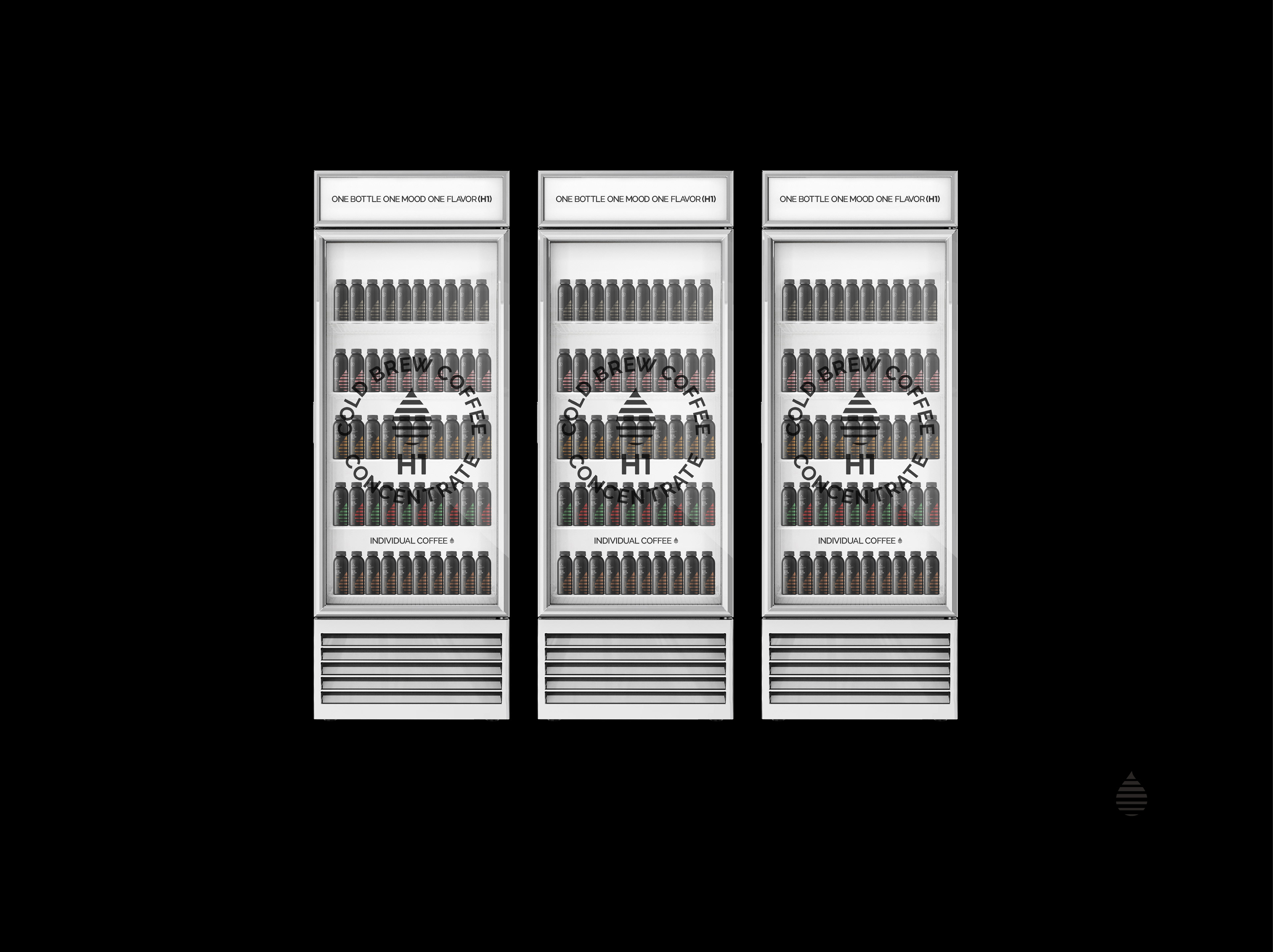
Handium Coffee Roasters - Brand identity for those individual bottles of cold brew coffee concentrate
Handium Coffee Roasters - Graphic design