
미더베스트 - Original color version of METHEBEST rebranding
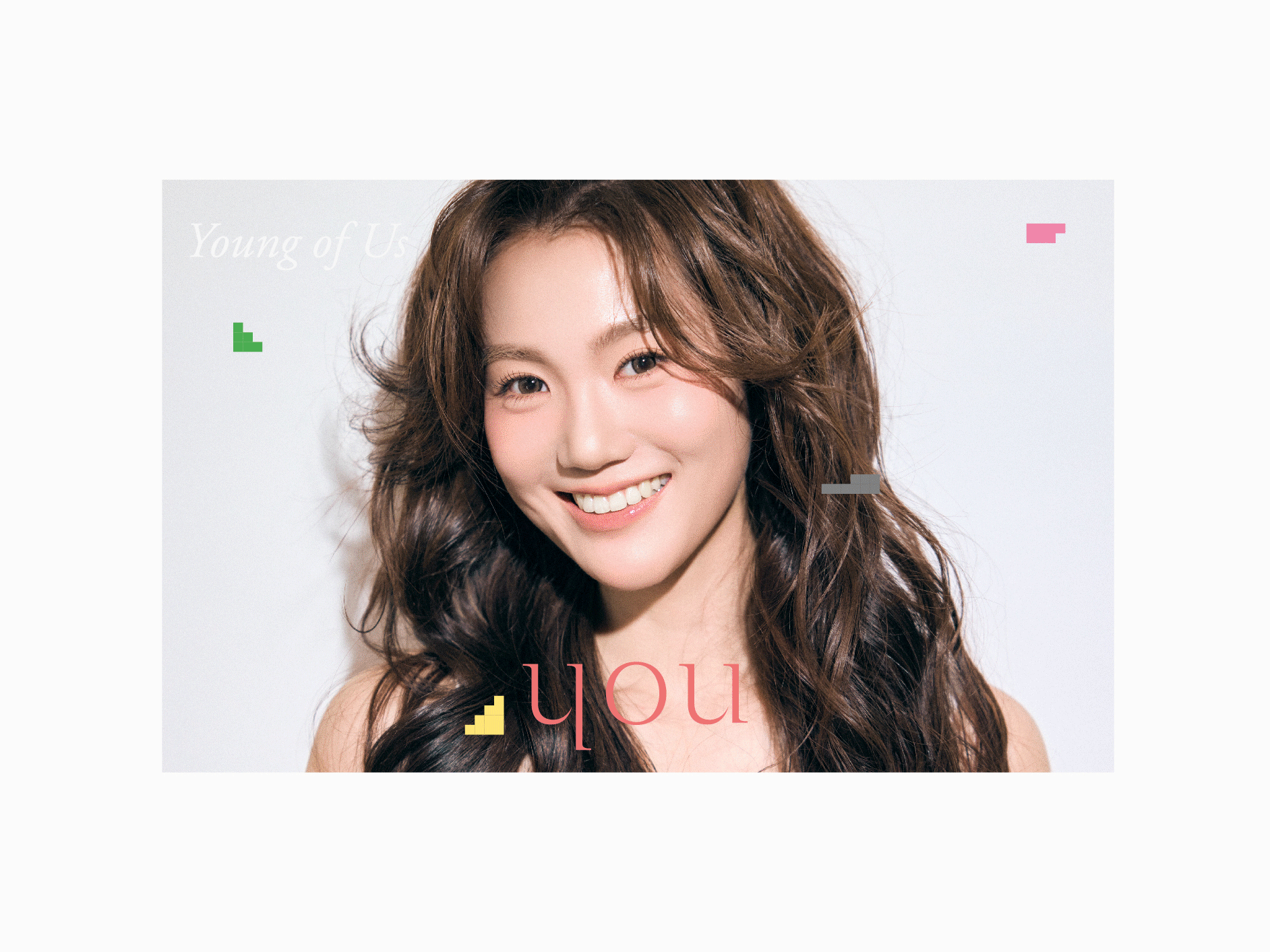
Additionally, they aimed to project a luxurious brand identity, inspired by Dior's typography and Tamburins' signature style.
MEETING THE VISION: during our initial consultation, Kim Hwa-Young, the CEO of Methebest and a prominent influencer in Korea outlined her vision for the brand, she desired an identity that embodies the essence of supreme beauty, fostering self-confidence and inner well-being alongside a radiant exterior.
Hwa-Young expressed her admiration for the luxurious aesthetic of Dior's font and the branding of Tamburins, emphasizing a similar direction for Methebest.
The previous branding appeared outdated, failing to convey the brand's premium quality or core concept.
THE REBRANDING SOLUTONS: font fusion to achieve the desired transformation, a new brand identity was created, and a font reminiscent of Dior's branding was incorporated and blended with another font that evokes the gentle touch of spa treatments and the luxurious texture of the cream, this unique combination is particularly emphasized in the accentuated "B" and "E" letters of Methebest.
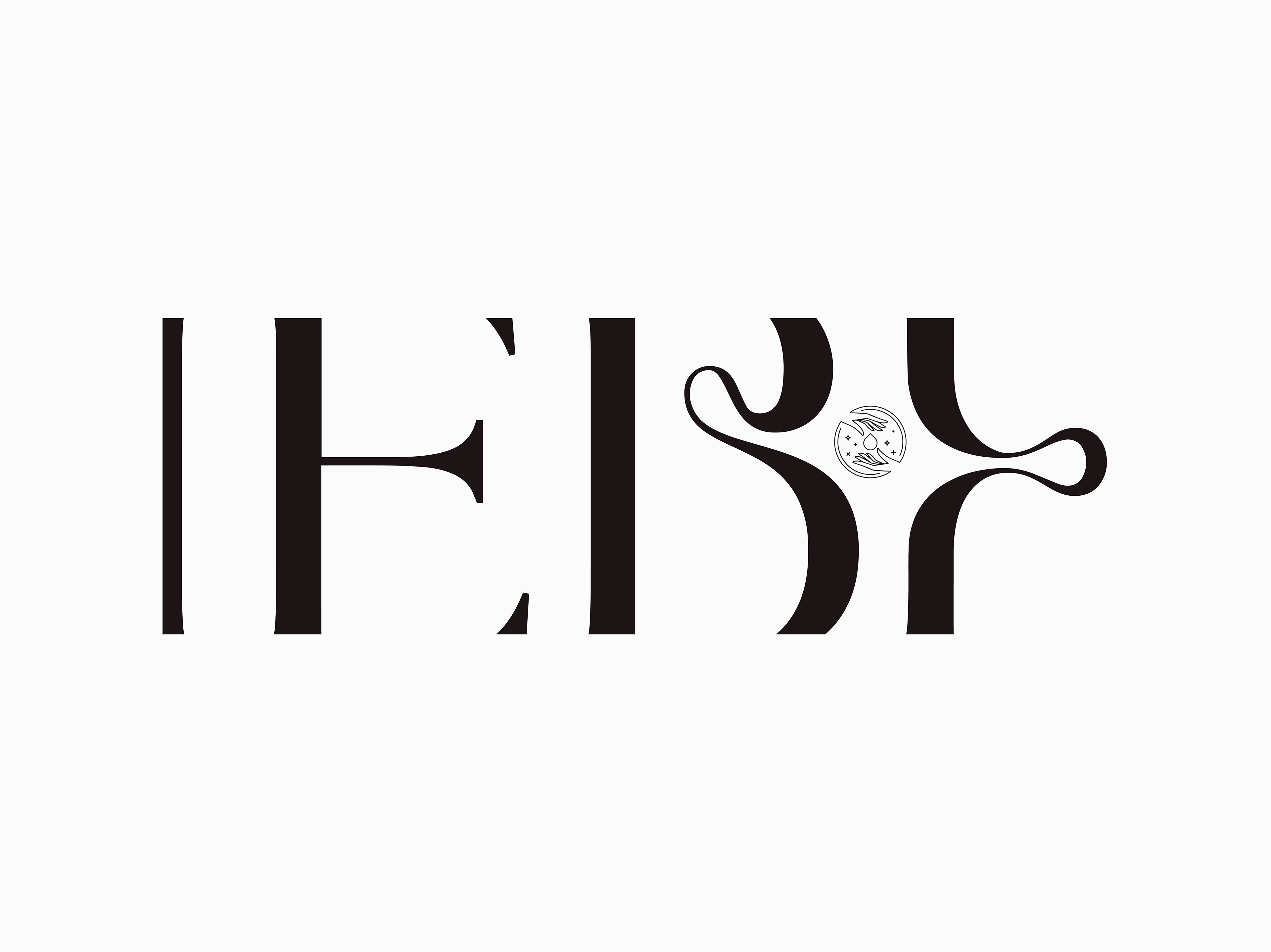
Signature style inspired by Tamburins' branding, a signature logo was developed for Methebest, this signature can be elegantly integrated into social media posts, posters, and other marketing materials.
Neutral appeal by recognizing the growing interest in men's skincare in Korea, a neutral color palette was employed to broaden the brand's appeal while maintaining a focus on its core target audience of young, sophisticated women.
THE RESULT: the rebranded Methebest now exudes a luxurious and contemporary aesthetic, perfectly aligned with Kim Hwa-young's vision, this new identity effectively conveys the brand's philosophy of cultivating both inner and outer beauty, making Methebest the ideal partner for achieving holistic radiance.

New branding application with the new retailing Methebest concept store

Premium color version of METHEBEST rebranding

Emblem variations

Ceo about Methebest brand (미더베스트)

Black and white version of METHEBEST rebranding

The signature logo can be a pretty way to brand an Instagram post or backpacking to remember simply the main logo
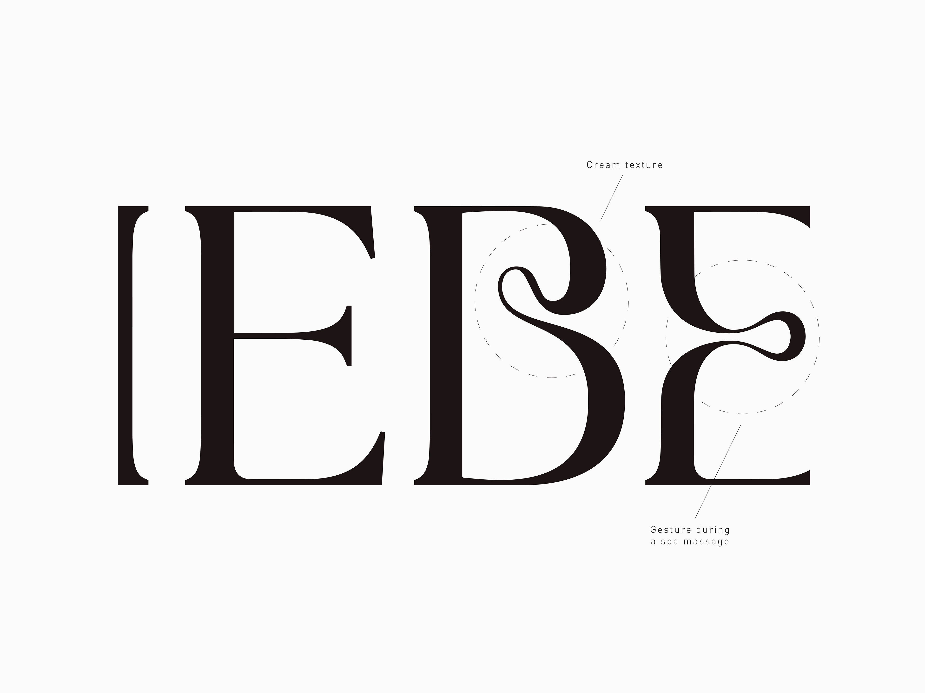
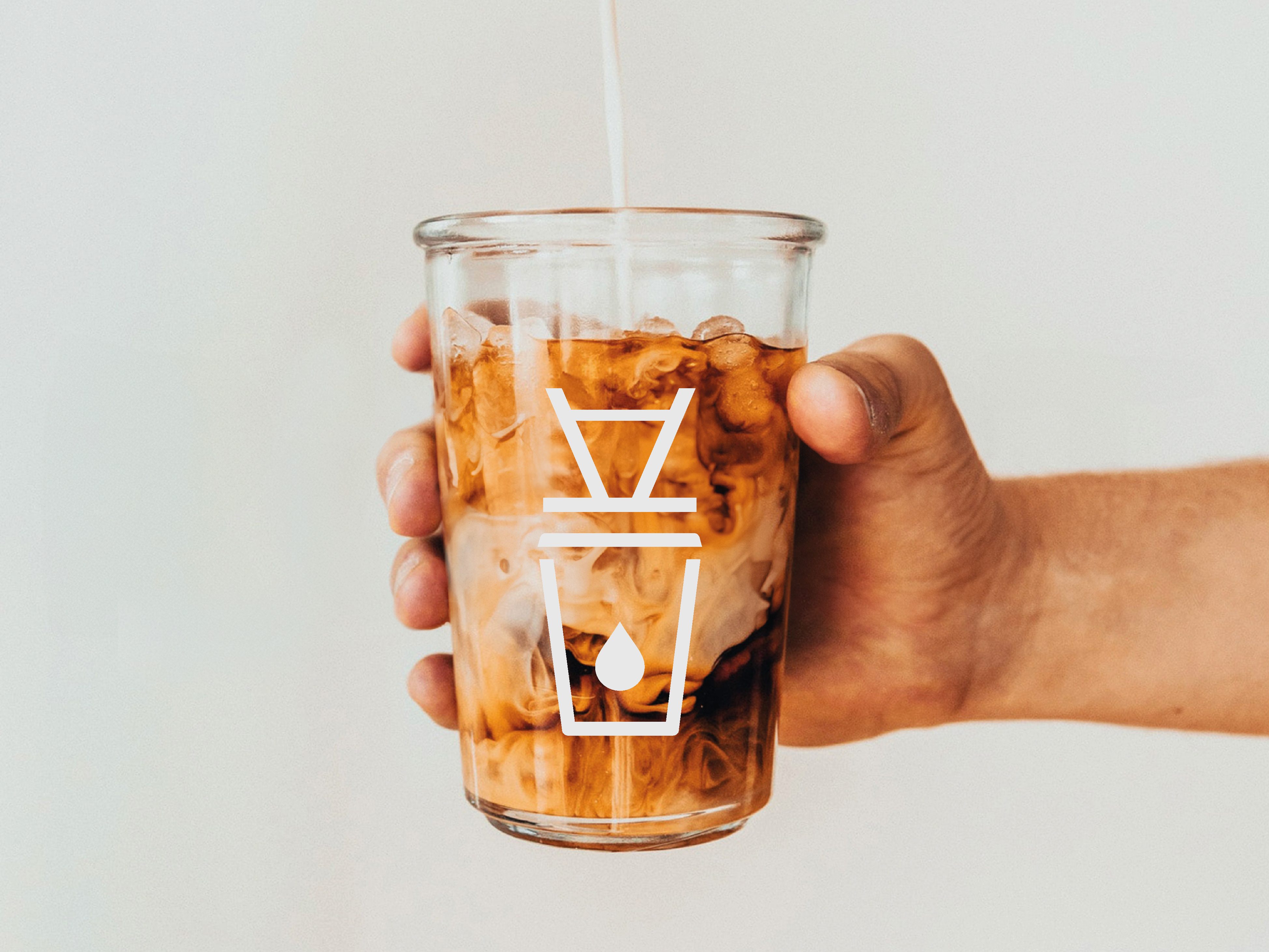
Methebest logo expresses the beauty cream texture or the gesture provided during a spa massage

Methebest keywords

Pictograms set - Graphic is based on METHEBEST logo design

미더베스트 - New branding application with the new retailing Methebest concept store
Based on the brand philosophy of being a place where beauty reigns supreme, at Methebest, we strive to cultivate not only outer beauty but also inner beauty.
Taking care of beautiful skin with the original intention of aesthetics, it is a name that embodies the desire to realize new values and culture of America.
Methebest will meet customers solely with skill and beauty.
Befitting the name of Korea’s No. 1 problematic skin specialist brand.
Pursuing changes in our customers’ skin, at Methebest we are a trustworthy skin specialist company with over 30,000 improvement clinical trials.
It's important to note that Methebest's commitment to excellence extends beyond branding, their academy offers national license classes, ensuring their staff possesses the expertise to deliver the highest quality skincare treatments.

Business card - Front side & back side

New branding application with the new retailing Methebest concept store

New branding application with the new retailing Methebest Academy
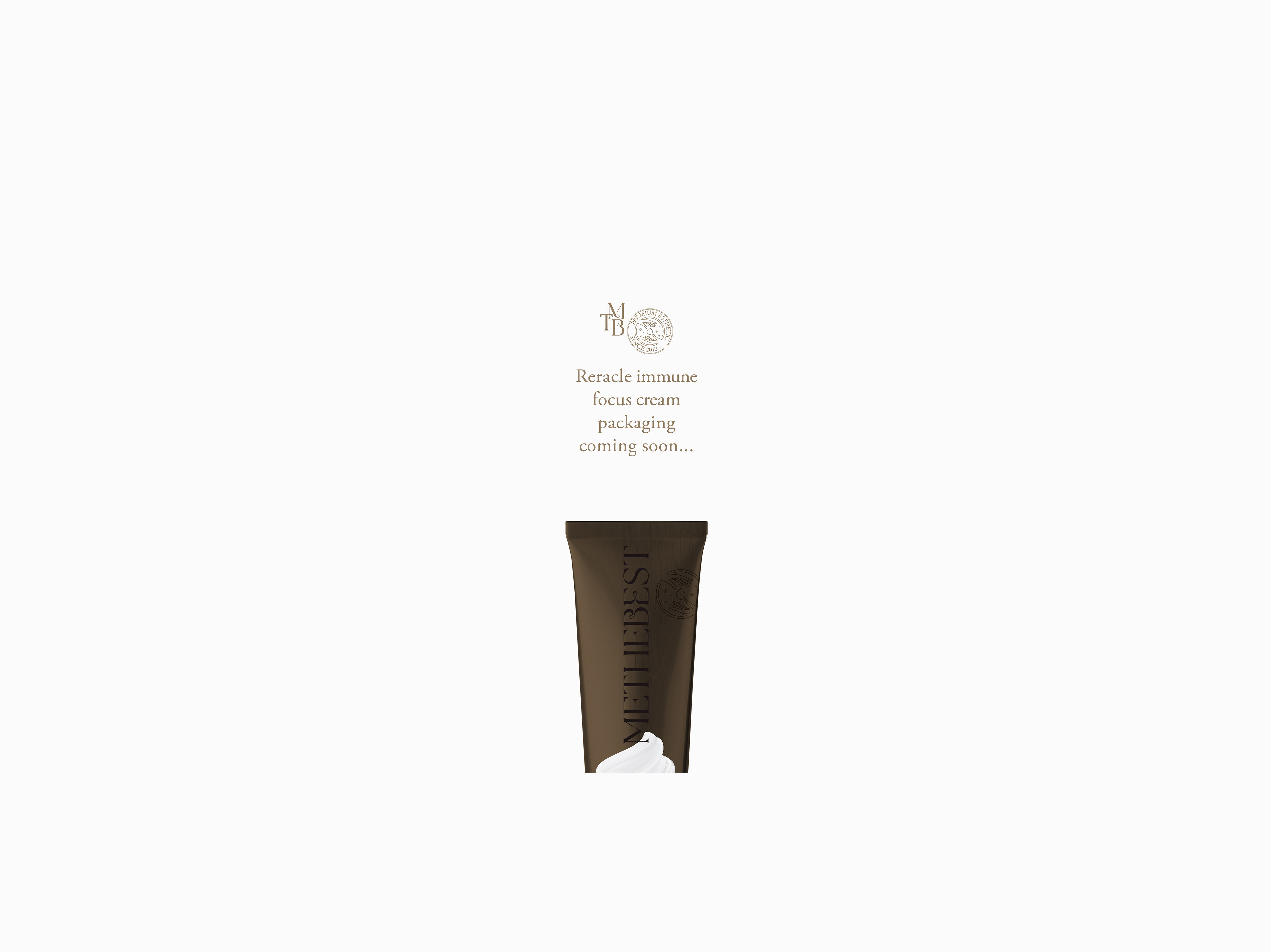
Methebest reracle immune focus cream packaging is coming soon...

Methebest - Graphic elements
Methebest - Spa salons massage franchise + cosmetic skin care - total rebranding + packaging design
New branding application with the new retailing Methebest concept store